The use of color in an image can completely change the look and feel of a shot, and achieving a harmonious color grade can be what makes your image stand out from the rest. Our guest blogger, Mareike Keicher, is a commercial and editorial retoucher, and in this piece she shares some of her best tips for creating color harmonies and her favorite tricks for beautiful color grading.
NOTE: This article uses images from an older version of Capture One Pro. To learn more about our latest version, click here.
Color is critical to my work as a creative. It has a unique ability to depict emotion and mood in an image, and my use of color is a key factor in landing potential clients for commercial and editorial retouching projects.
That’s why Capture One Pro’s photo editing software plays a huge role in my work – it delivers everything you need to create beautiful color harmonies for any image. It also helps me work more efficiently – the ability to synchronize edits and compare different color schemes using variants improves workflow and consistency throughout projects.
Here’s a look at my editorial process when working with color grading in Capture One Pro.
Color grading for different image types
Color grading will largely depend on the genre, style and intended use of the images – usually set by the photographer or the client. In this blog post, I use color grading which aligns with a more commercial or lookbook approach.
The challenges of color grading
There’s all kinds of variables that can make the color grading process difficult. For example, in still life photography, I can’t adjust make-up tones or clothing in a way that I find pleasing to the eye because the products need absolute color accuracy for sales purposes. These factors (genre, style, usage, color accuracy) shape what we are able to do as retouchers. It also helps us immensely when photographers shoot with color grading in mind.
How do I choose the right color scheme?
There is no general approach to color grading and you can often create and choose from several color schemes if the photographer or client does not have a particular one in mind. A lot of different color schemes can work with a particular image when it is applied correctly and the tones are balanced.
The concept of color harmony is in general more an objective principle than a subjective attitude. There are color themes developed from systematic color relationships as a base for composition.
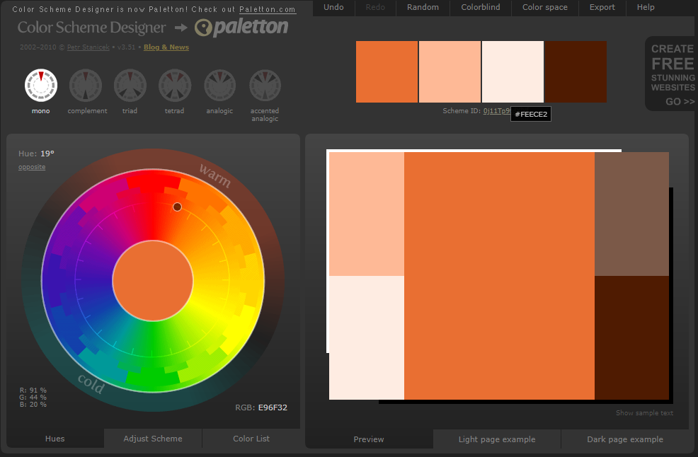
Color Scheme Designer is a useful tool for choosing colors – it contains a color wheel based on the foundation of Goethe’s color theories. It depicts the different color hues and how they relate to each other, which can aid in defining specific color palettes for grading. It’s not about copy & pasting the hex color codes, you can do it by eye.
In order to find a fitting color scheme for our purpose, we must first analyze our image or images and make a decision about the primary color. This is done by factoring in the following:
- Concept (e.g. seasons, elements, animals),
- The predominant color,
- In product photography, considering which specific color tone can’t be changed (make-up / clothes/ accessories),
- The intended focus of the image
Analyzing these elements helps us define our subordinate, accompanying colors for grading. For beauty images, the main color could be a make-up tone for example, combined with muted/desaturated skin.
Composition and focus – tips for better color grading
When you tone an image, the weight, saturation and relative size of colors should be similar to a harmonized palette. Here are some general rules to balancing the weight of the colors:
Concept of weight: Use the proportions of the color scheme in the right way. Separate the image into elements (you decide how many) and distribute the hues. Don’t forget to balance their proportions with saturation and luminosity.
The position of the elements change the relative weight.
The usage of color contrasts can add value to an image but also change its weight. We usually distinguish between: contrast of hue, light-dark contrast, cold-warm contrast, simultaneous contrast, contrast of saturation and contrast of extension. Make sure to use one contrast as a main and the others with restraint, if at all.
You can use the “Annotations” tool to create markups for your ideas. If applied in the wrong proportions, an image can look odd even if the hues of a certain color scheme are used.
What makes Capture One such a powerful tool for color grading?
Besides the Color Editor and the extensive range of Capture One Styles with preset adjustments for grading, Capture One Pro has powerful color editing tools that allow you to create the precise color grading you want and capture every nuance:
Color Editor > Skin Tone > Uniformity. Using the skin tone adjustments in separate layers to even out different variables for hue and saturation can be very powerful. Not only on skin (like the name suggests) but also on clothing or the background. If you choose this dialog on a separate layer and adjust another hue, you can get rid of unwanted hues (e.g. 5 shades of green) to obtain better color harmony.
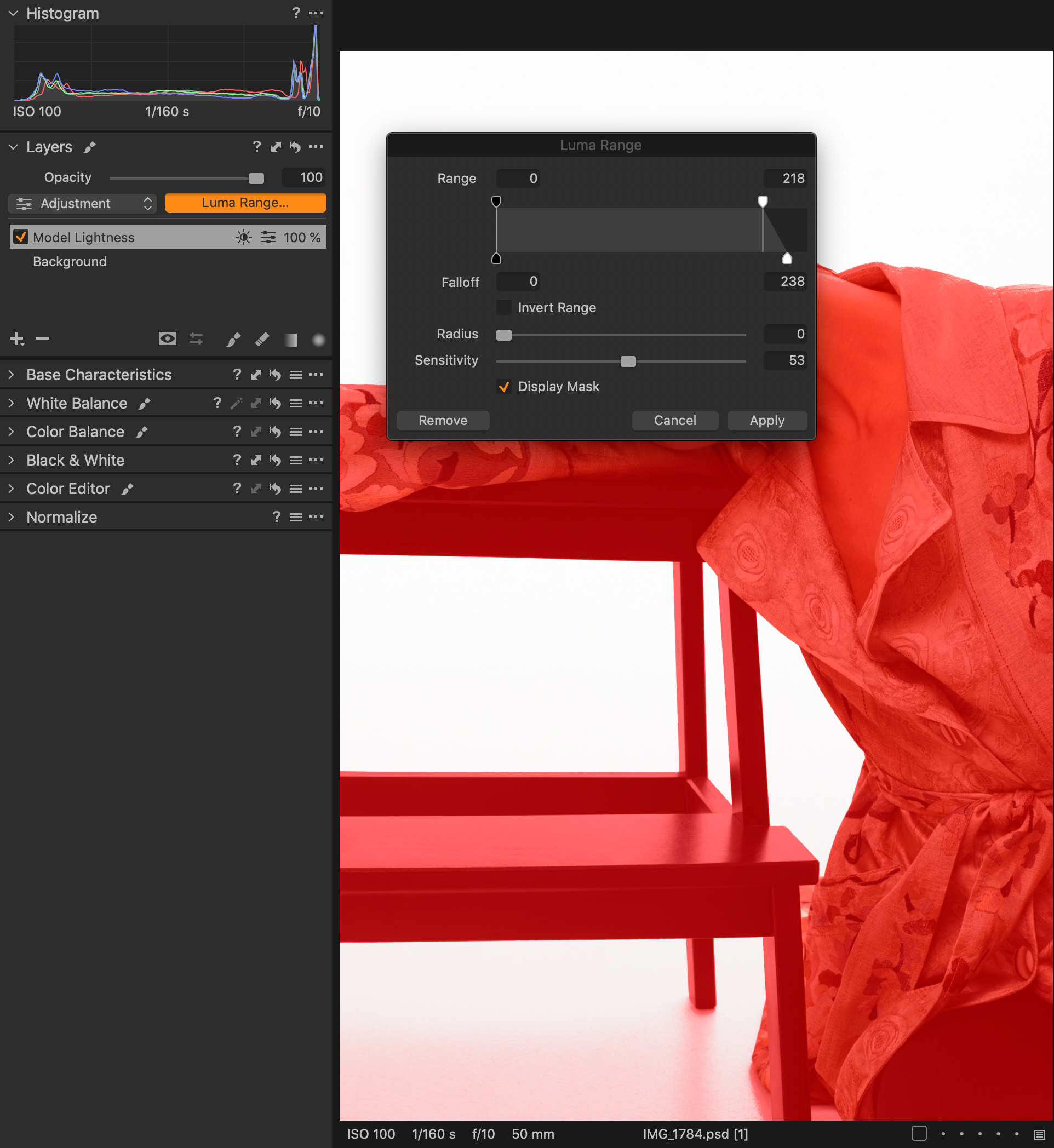
- The Normalize tool is a good option to help match your reference image(s). You can pick the highlight value from your reference image and apply it to a similar area of the RAW file, then use the luminosity masking tool to limit adjustments to the specific highlighted areas. The same technique is used for mid-tones and shadows.
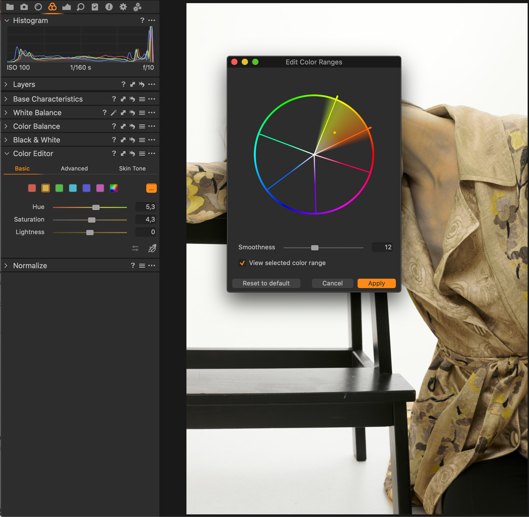
- The Basic Color Editor and the Direct Color Editor. I really like that the color squares are not static. They can be easily adjusted by clicking on the ‘Edit Color Ranges’ button. Another very nice, time-saving feature is the automatic selected ‘View Selected Color Range’, which makes the selection visible by showing the not-selected areas in grayscale representation.
- By using the ‘Direct Color Editor’ tool (shortcut: D) – which can be accessed either below the Hue/Saturation/Lightness adjustments in the Menu Tab or in the toolbar on top – Hue/Saturation/Lightness can be adjusted separately by predefined actions e.g. clicking and moving horizontally/vertically/etc. within the image itself. The other tabs within the Color Editor have their own tools and work differently.
![]()
What are color schemes and how to use them?
A color scheme is a collection of colors that create color harmony when applied in the correct proportions. It guides the viewer to the focal point of attention in the image and prevents them from getting lost or fatigued.
Whilst there are 6 different variations found on Color Scheme Designer, there are also additional combinations such as tetradic, square or achromatic color schemes.
Here, I’ll focus on four of my favorite color schemes, which can be used together in a series of images to create tension as well as consistency.
Mixing Color Schemes
It’s quite common to mix color schemes within a set of images. However, it’s important to match the concept and the story/mood. There should be a common thread to unify the overall look.
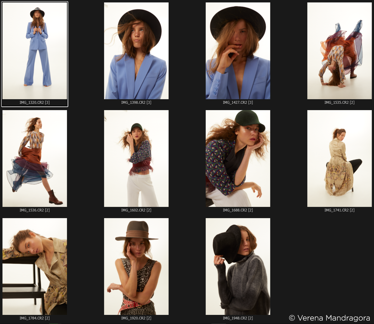
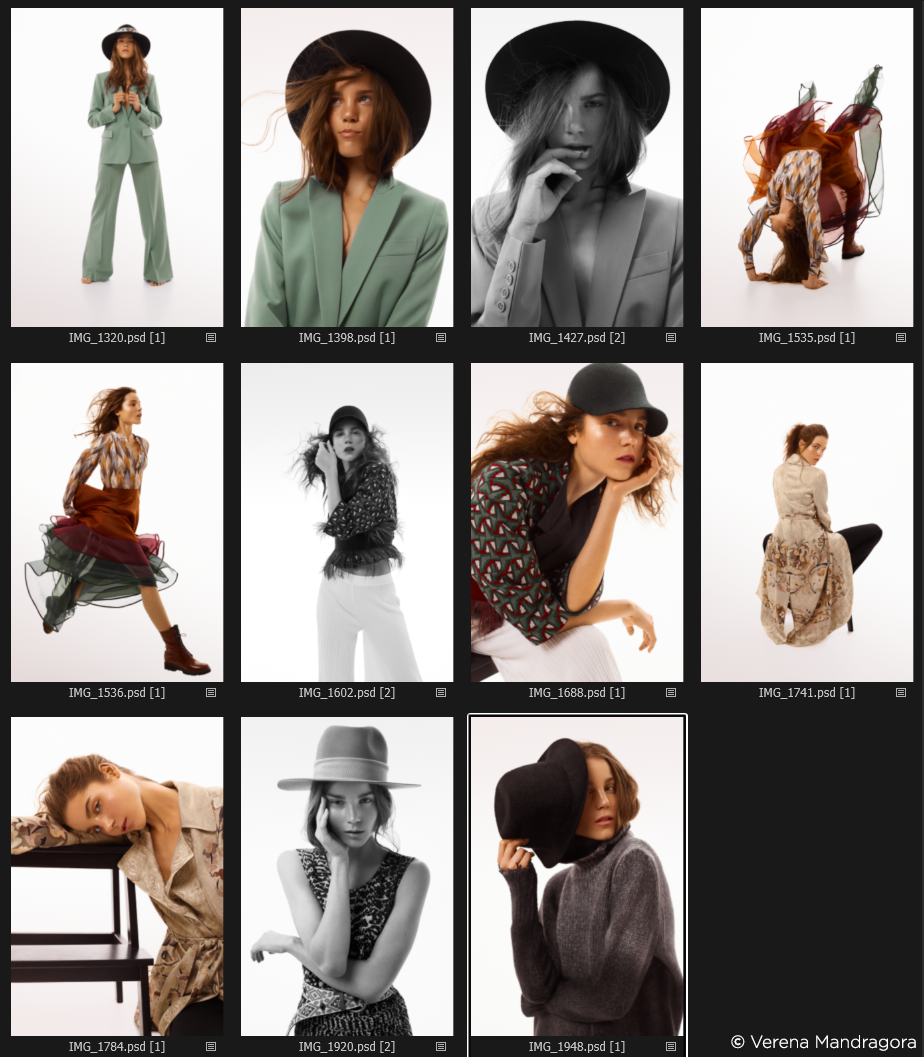
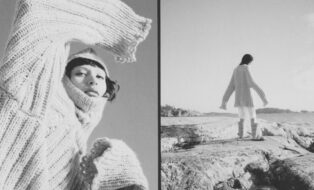
Here you can see an overview of the example set. All six looks need a common thread and each image should be harmonized on its own.
The brief requests a mix of colored and achromatic looks.
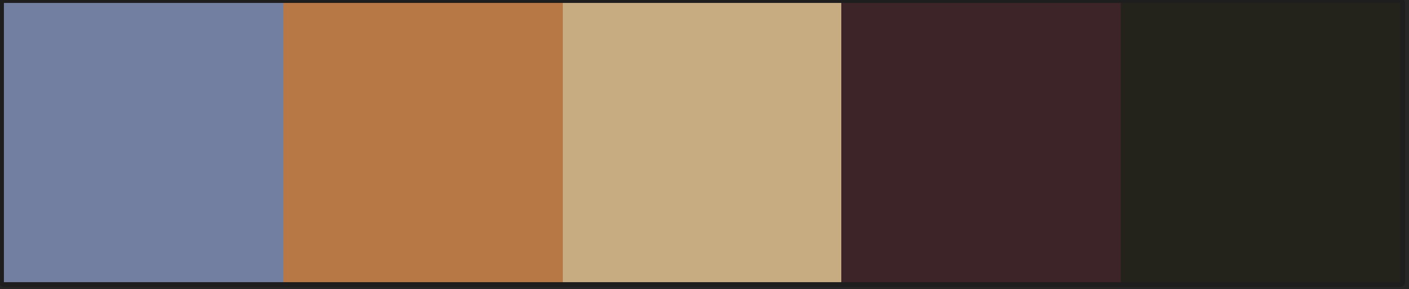 Some colors from the example set chosen with Adobe Kuler.
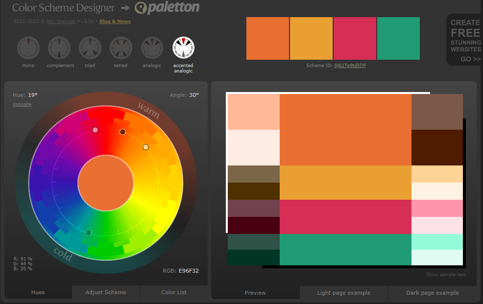 Accented analogous color scheme contains most of the colors of the set and can therefore be used for this set.
Accented analogous color scheme contains most of the colors of the set and can therefore be used for this set.
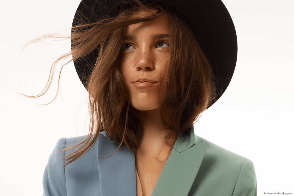
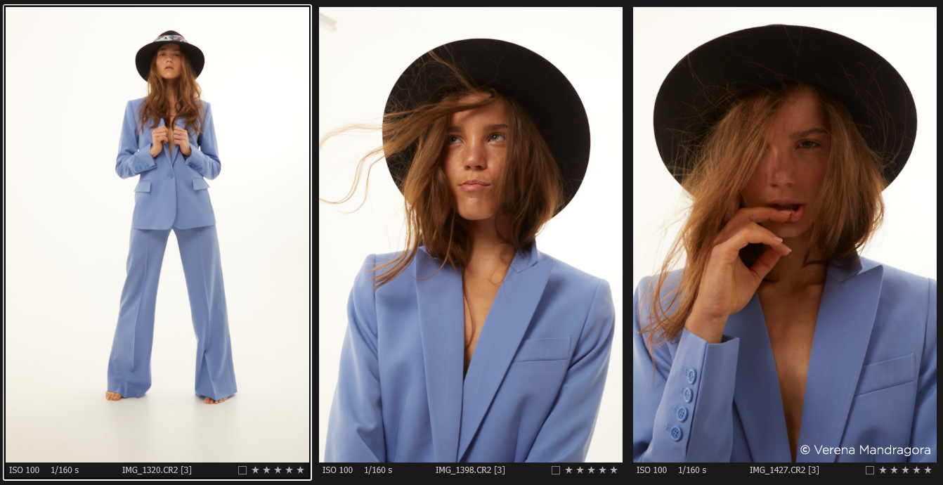
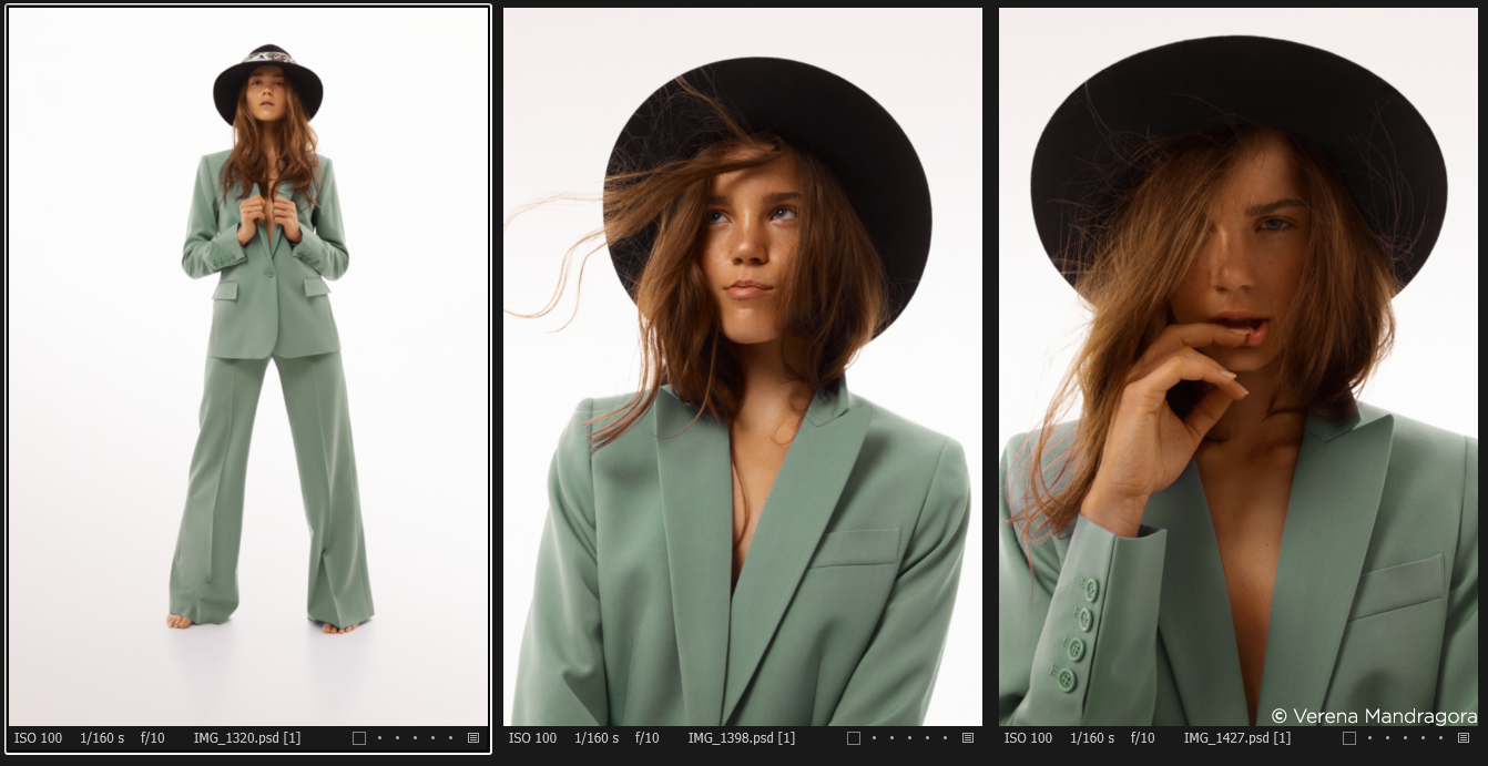
Having a closer look at the color schemes, you can see that we can use an accented analogous color scheme if we shift the blue of the blazer to a greenish tone. Of course, not every image contains all of the colors, so in this case we’ll also choose a complementary/monochromatic color scheme derived from the previous color scheme.
In order to achieve a commercial, clean look and include some achromatic images, I picked a neutral background color. The colors of the skin tone should be healthy-looking and consistent within the set. One important tip that is often ignored or undervalued is that the other colors then need to be muted or neutralized. In this case it’s mainly the blue tones, deep purple and (greenish) yellow.
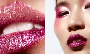
Accented analogic scheme
Color scheme proportions: 40% – 20% – 20% – 20%
The accented analogic color scheme is a combination of the analogous and complementary color schemes which are described further down this blog post.
Using the new Basic Color Editor, I adjusted the blue, green and yellow tones because they are the more ‘unfavorable’ tones in this instance. I then moved onto some smaller and more precise corrections, as you can see below.
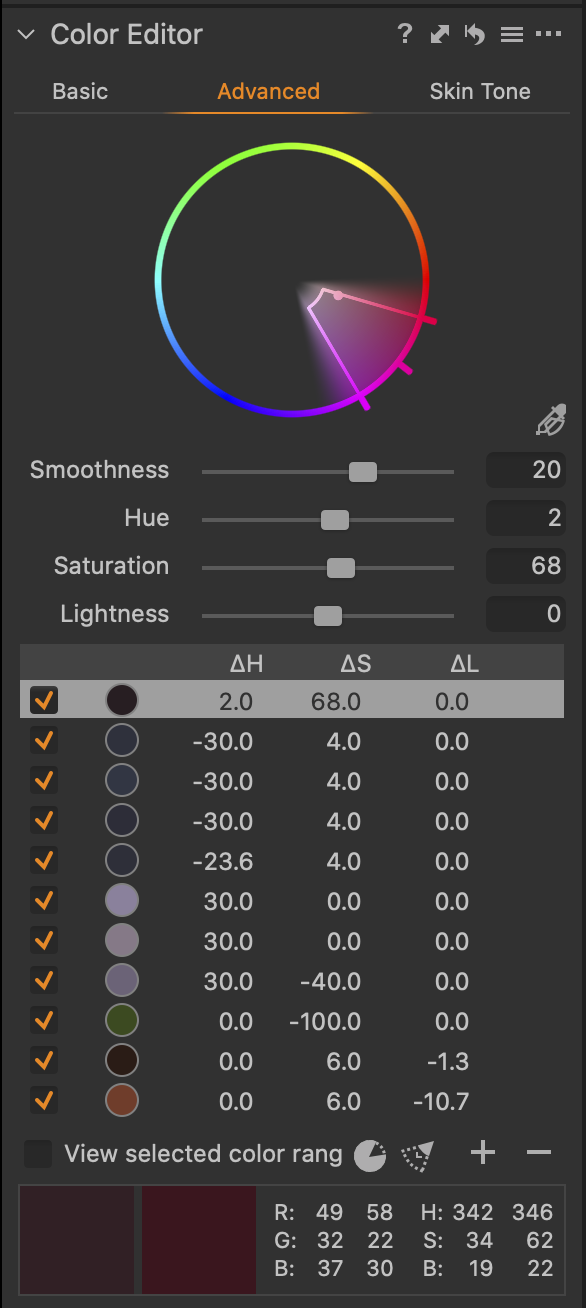

As you can see, the majority of my adjustments so far are achieved by using the Advanced Color Editor. By saturating the magenta tones, I was able to put more focus on the skirt. I also adjusted the blue to a greener tone. Next, I neutralized the light purple to grey followed by desaturating unwanted yellow tones. To finish off, I darkened the orange tones of the skirt for some balance before using the Skin Tone adjustments to even out color shifts in the skin.
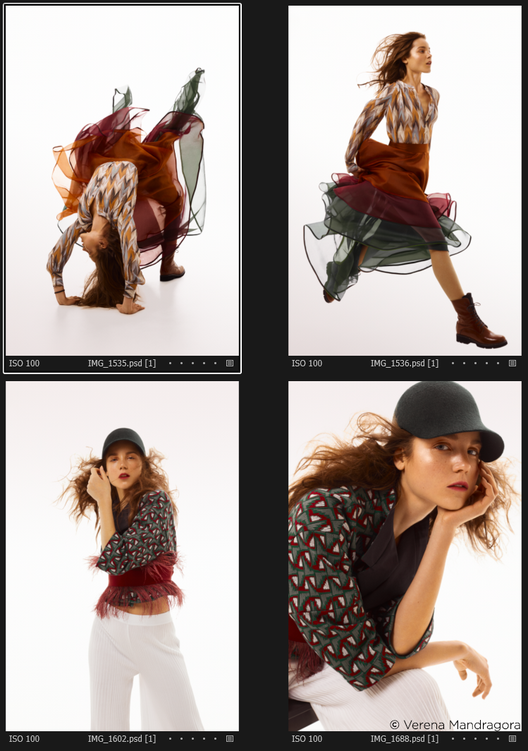 Final Result after some minor corrections in Photoshop.
Complementary color scheme
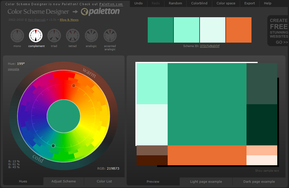
Color scheme proportions: 70% – 30%
Complementary colors are when two kinds of colored light yield white when mixed with each other. If we isolate one hue from the prismatic spectrum, for example green, and collect the remaining colors – red, orange, yellow, blue, violet – with a lens, the mixed color obtained will be red, i.e. the complementary color of green we isolated. The color scheme was built from this physical principle.
The complementary color scheme involves the use of opposite colors on the color wheel. It’s quite popular because it’s naturally pleasing to the eye, but be careful not to use both colors equally. One of these colors should be more dominant.
For a more efficient workflow, I can synchronize the accented analogous color scheme from before and adjust the green tones. It’s often useful to start with the most complex color scheme first.
 Final Result after some minor corrections in Photoshop.
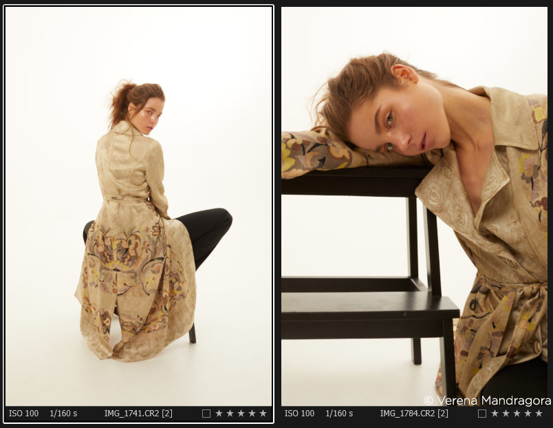
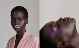
Monochromatic color scheme
Color scheme proportions: 100%
This color scheme involves only one hue and is based on varying luminosity and saturation values of a certain hue. It’s best for single subjects. In warm-neutral compositions, warm colors and neutral ones are mixed.
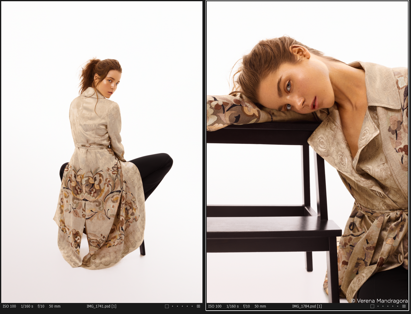
After synchronizing and erasing unnecessary changes, I slightly adjusted the red hues and the saturation of the oranges. I always prefer to have some small variations in color even in monochromatic images, so it doesn’t turn out flat and fake (especially with skin tone variations). I also brightened the model in image 1784 (right image) on a separate layer using the new luminosity masking feature (I ignored the background highlights to achieve equal brightness in all the images).
 Final Result after some minor corrections in Photoshop.
Achromatic color scheme
In achromatic compositions, images are composed with black, gray and white tones or contain colors with very low saturation values. This color scheme can be applied in the Black & White or Split Tones Tab. It’s also possible to use black and white Styles in Capture One.
The luminosity values can be influenced in the final black and white image by adjusting the colors in the Color Editor.
General Settings
I usually turn off the automatic sharpening in Capture One Pro. Even though the tool is highly advanced, it can cause more work for me in Photoshop, for example with peach fuzz. Photoshop’s tools tend to have issues with repairing more contrasted textures. Therefore, my final step in Capture One Pro is to add partial sharpening on a separate layer in model images (if necessary). This allows a non-destructive workflow since applied sharpening in the RAW conversion can’t be changed, applied sharpening to a PSD/TIF file at the end can be altered easily.
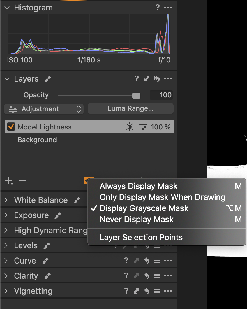
In the masking mode, it’s very handy to have an overview of all the sharpened areas in all images. The white balance in this series was set correctly and consistent and therefore no adjustments were necessary. The only adjustments necessary were some changes to brightness and exposure. To finish the process, I added some (individual) contrast using curves in Capture One Pro.
Final result
Extra tips
With different collections of preset adjustments, applying Capture One Styles to your images can help speed up your workflow and let you try different looks. Always check and compare or use the pre-created Styles to push your creativity and help you find the right color schemes.
Of course, this is not a typical set for a highly creative color grading where mid tones, highlights and shadows are used for supporting color schemes (split toning). Therefore, you can use the Color Balance Tool in combination with luminosity masking. Adjustments in color temperature is an alternative option that allows you to work in a more creative way with color. An ordinary set would be an editorial photographed on a countryside or a colorful or playful interior scene.
If you want to learn more about color harmonies and how to use them to their full potential, I recommend analyzing editorials in magazines and studying historical painters. Goethe, Itten and Kandinsky’s color theories also give further insights into color harmony.
For the technical side of things, check out Capture One’s free webinars and tutorials.
If you don’t already have Capture One, you can download a 30 day trial and try it out.

Mareike Keicher
Mareike Keicher is a commercial and editorial retoucher from Germany. She’s combining theoretical and technical knowledge, vision and precision to make each image perfect for the client. She loves working with photographers from all over the world to get to know different perspectives and create different looks and styles in her daily business.
This sounds really interesting and the results look great, but it’s rather hard to follow in this article. It would be great if you asked Marieke to present a video seminar on these techniques.
Great article with really useful tips!
The content would have suited a video format as well with before/after demonstrations and seeing the thought processes at work.
Webinars/tutorials with experts sharing their knowledge would be much appreciated over the redundant feature demonstrations that are currently repeated time and again.
I agree, video seminar would be awesome!
Link to the Color Scheme Designer doesn’t work – it displays “Account Suspended” page.
I like the concept and article. Being a “visual” learner a webinar or video seminar would be helpful.
It is actually what Natalia Taffarell jas been teaching gor many years. Color grading is among the most important retouching techniques! As vocational school teacher I keep preaching this to my students over and over again
I agree with Simon. The article contains a wealth of information and expertise but for into sink in I think a webinar would be really helpful. A big thank you to Mareike.
Interesting concept but I found to be confusing & difficult to follow. Perhaps a video would have been more appropriate.
I agree a YouTube tutorial or workflow demo would be great!
As a visual learner, I agree that it was difficult to follow. But good content.
I understand the concept of color harmony, but as a capture one newbee I absolutely can’t follow this implementation guide. Therefore I kindly ask for a webinar or any kind of video guide. Thank you very much in advance!
This would be great but Capture One 20 will not run on my Windows 10 machine. Is there a support team that can assist?
I wasn’t aware of the normalize tool and even after reading the manual, it’s difficult for me to use it in a way, I am satisfied with the results.
If I pick a skin tone, which would be it? The most ‘middle exposed’ skin tone? Because in each image, there are variations of the skin tone, obviously.
Thank you.
I have a question related to the normalize tool. You state that you use the luminosity mask to apply it selectively. However, technically the normalize tool is not applicable to layers. How do you achieve this selective application?
This looks very interesting but it is rather hard to follow. The author is clearly highly knowledgeable but the article fails to communicate to aspiring learners. I would very much appreciate a simple step by step tutorial using one overarching colour scheme to grade a small set of images.
Thanks Mareike,
Following your tutorial and remembering your smile the picture has to be great,
Thanks again for both,
A