
There are few places in the world that feel as old and ancient as Australia’s Kimberley. Sitting in the far north of Western Australia, the Kimberley is renowned for its remarkable coastline, but inland is no less enchanting or intriguing as can be seen by this photograph taken in a ‘secret spot’.
Unlike more recent landscapes with their sharp points and naked cliffs, Australia’s landforms are softer and more weathered with a unique patina and a distinctive color palette. People who have never visited Australia often accuse photographers of ramping up the saturation slider in their photos, but once you have visited Australia’s outback, you quickly realize how vivid the colorful landscape can be.
On this particular morning, some distance south of Kununurra, it was 95 percent humidity on the ground. Of course, shooting from a Bell Ranger helicopter at altitude, it was very pleasant with the doors off and the wind in our hair. Well, it would have been in my hair if I weren’t almost bald!
However, the humidity reduced contrast and created a distant haze which softened the natural color and hid the variegated landscape. The challenge was to use Capture One Pro 9 to bring the scene back to life and what I experienced.
Color Balance vs. White Balance
Sometimes with scenes like this it can be challenging to get exactly the correct color balance – at least aesthetically. And there are a number of different approaches I use, depending on the challenge at hand.
There is white balance and then there’s color balance. They are different mathematically, but both can be used to set the overall color cast in an image.
We normally associate white balance with capture and this is often the first adjustment we make to a raw file. White balance is set with two sliders – a yellow/blue slider called Kelvin (for color temperature) and a magenta/green slider called Tint.
In comparison, color balance is something we use to adjust an already processed file and it is set using a combination of red, green and blue channels. I usually think of color balance as something I do to an already processed file, rather than a raw file, but within Capture One Pro 9 you have both options for your raw files.
Sometimes I find it easier to use one or the other in order to achieve the desired output when processing my raw files. However, it doesn’t really matter which one you use, as long as you like the result.
Correct Settings
All cameras can be set to record an auto white balance at the time of capture (the setting is called ‘Shot’ in Capture One Pro 9) and more often than not, the result is spot on. However, ‘accurate’ color balance and ‘aesthetically pleasing’ color balance can be two completely different things.
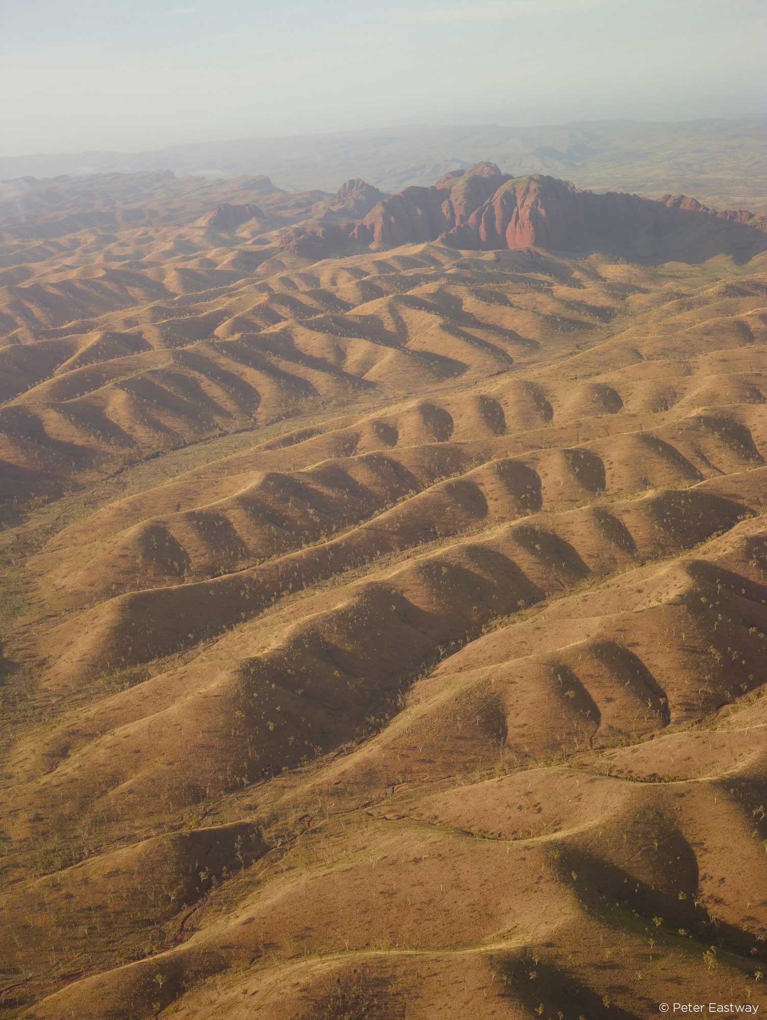
I struggled with the white balance in this image. What I remember are the strong yellows of the grasses and the rich reds of the rock faces. Neither are present in the raw file exactly as I wanted them and nor could I solve my problem with either the white balance or the color balance tools.
Of course, it is theoretically possible with both controls, but I simply struggled to find exactly the right combination, even with a correctly calibrated Eizo ColourEdge monitor.
Then I remembered an approach I learnt many years ago in Photoshop – and no doubt pre-press operators used it before Photoshop even existed. The technique uses the Levels tool to adjust each of the three color channels (R, G and B) independently.
When you look at the Levels dialog box in Capture One Pro 9, you’ll see four options: RGB, Red, Green and Blue. Normally we work in RGB because this is a combination of all three color channels. When you make an adjustment in RGB mode, you are effectively changing all three layers together.
An alternative technique is to change the channels independently. My approach is to open each color channel and drag the white point and black points in to the edge of the histogram – you can see what I have done in the diagram here:
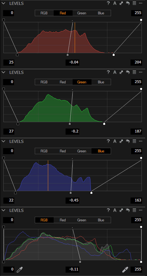
With the white and black points positioned correctly, I often find I have a very good color balance, or at least a good start. Next I grab the mid-point on each of the channels and drag it to the left or right to control the color balance.
Don’t ask me why this approach works. And don’t let the Capture One programmers read this either because they have spent years refining their color and white balance dialog boxes to essentially do this more easily! However, after trying the other controls for quite some time, I found this approach gave me exactly the colour balance I wanted.
PODAS In Kununurra
I guess this proves the point that there are often several different ways to achieve the same or a very similar result in Capture One Pro 9.
Once happy with the color balance, I used six Local Adjustment layers to darken down the sky, add a touch more red to the mountains in the background and create a highlight on the central hills.
Would you like to visit this location? Along with Christian Fletcher and Tony Hewitt, I will be leading a week long PODAS workshop based in Kununurra this May, and it includes a couple of helicopter flights, one of them over this area. And you can be shooting it with the new Phase One XF 100 MP system as well!
The PODAS, from 23-29 May 2016, also includes in-depth instruction on using Capture One Pro 9 and general post-production.
Peter Eastway
Peter Eastway’s passion is undoubtedly for landscape photography, but he is equally comfortable with portraiture, advertising and travel. He is currently an AIPP Grand Master of Photography, one of only a dozen in Australia and earned from a career spanning over 30 years.
This is a common approach when grading motion footage. Balance the RGB relationship for the blacks, as there should initially be no colour cast in the shadows, also make black levels overall technically correct. Then do the same for the whites as they should be mostly uncoloured too. The mids will always be mostly reflected, coloured light and often look fine once the blacks and whites have been adjusted. Capture one rocks by the way, the film grains are awesome. Do you need anyone to film the PODAS trip by any chance?
Hi Chris
It was probably a motion picture or an old CMYK pre-press expert who showed me this technique!
I’ll keep you in mind for the PODAS, but unfortunately for you, Christian Fletcher’s twin brother Michael would probably be asked first – nepotism I guess!
I agree, it’s a technique I often use too for still photography. What software do you colour grade in? I’m trying to get my head round Speed Grade just now.
And yes, CaptureOne is fantastic!
Over the years I’ve simply relied on my Eizo monitor and either Capture One or Photoshop – but I like the idea of specific colour grading software. Must look into this – thanks!
Thanks for sharing Peter. I love your honesty in how you do what it takes to make it work. The finished image is mesmerising with the lines, colour, shadows and contrast … quite hypnotic if I keep looking into it 🙂 The red rocks in the background are pretty trippy … nice one!
Thanks Dave!
Can’t believe it took me so long to remember this ‘old timer’ trick – I had been struggling with the colour in that shot for longer than I should admit in public!!!
I have used this technique when I have had trouble finding a good color with other tools. I might use the color I get using the technique in the article or I might use that color as a ‘touchstone’ while I use WB or Color Balance tools..
Just some other notes: Using levels doesn’t work so well when a channel is either clipped or blocked. I feel my final image is very contrasty if I use levels to adjust color this way. I have to keep an eye on contrast :^)
In theory this technique can be used with Curves as well, after which you have a little more control over contrast – but maybe that’s what you were suggesting!
Thanks Peter, this tool changed my work a lot. But I`m still confused if I shoud apply levels at the begining or at the end…
Starrting from levels allows latter tuning, but finishing with levels makes all histogram streched and is recommended to do it after contrast, clarity adjustments…
I generally do this levels adjustment early in proceedings, but if you start to play around with curves or other exposure adjustments, when you return to the levels dialog you will see things have moved around a bit – which may or may not be a problem. Hope this helps.