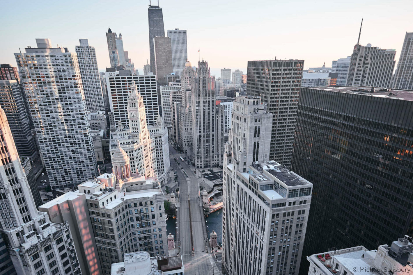
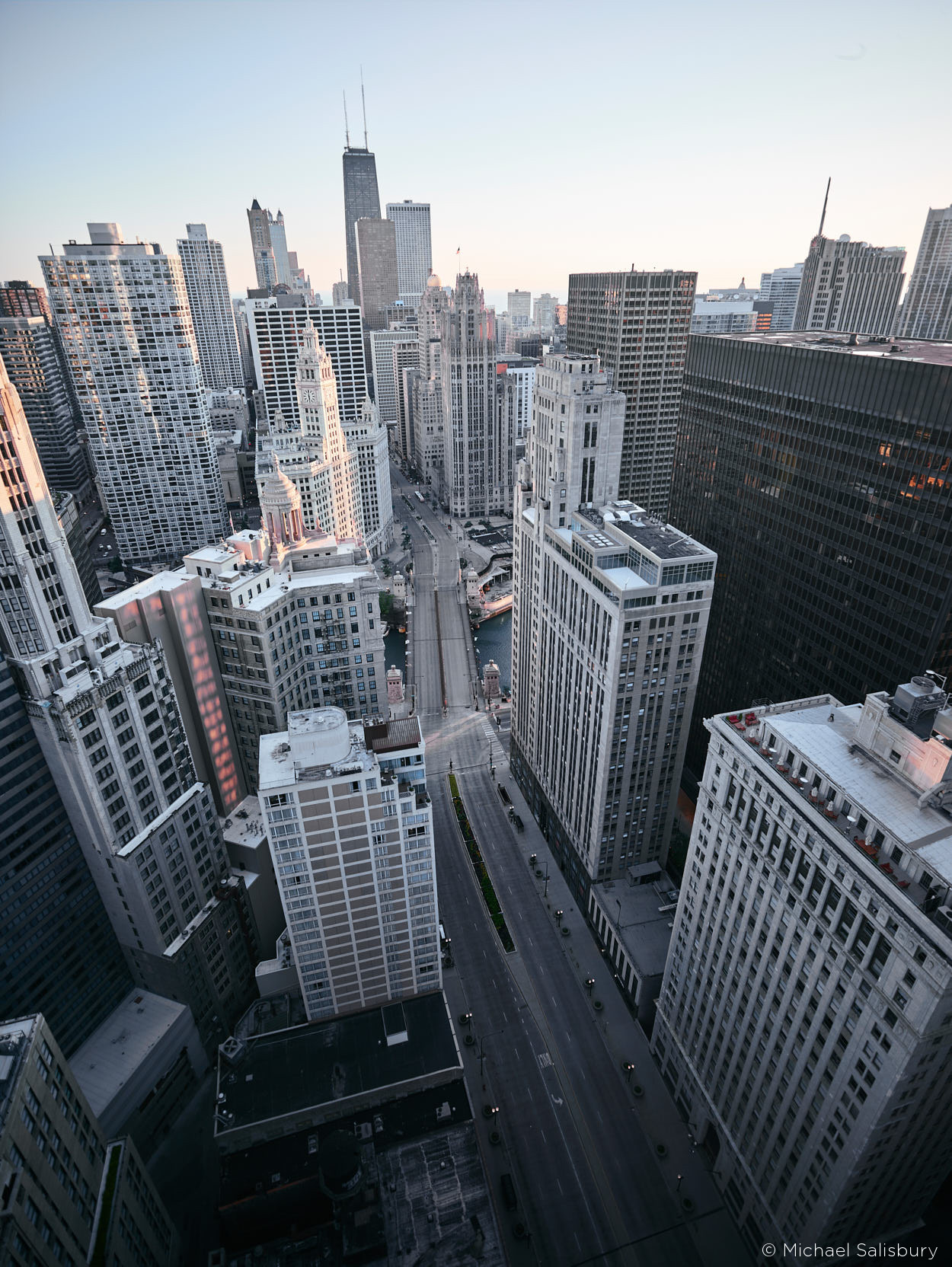
It was a cold and windy morning in Chicago, and the sun was just beginning to peak over the lake. I was more than 500 ft in the air, standing on the roof of the Hard Rock Hotel. I cleaned the sleep from my eyes while trying to decide the best angle to shoot from. I’m no stranger to heights, much of my work showcases the city of Chicago from high angles – but being on the ledge of a building 40 stories high is an unforgettable experience. I don’t often shoot the city at dawn, but have always enjoyed it when I do. It’s such a great time to take photos, as everything seems less chaotic and serene. The light on the buildings is noticeably different, and it’s a nice change from the norm.
Choice of equipment and settings
My equipment for this shoot was an XF IQ1 80MP. The lens was the Schneider Kreuznach LS 28mm f/4.5. I chose this lens because I wanted to capture the canyon of the street perfectly, and knew I needed something wide to do so. The wide angle also increases the feeling of vertigo, which worked perfectly in this scene. I wanted as little noise as possible, so I set my ISO to 35, which left me with a shutter speed of 1/40s.
Recreate your style
When it comes to grading, I tend to favor a more dramatic and emotional tone to my photos. With consistency, it gives my work a recognizable style, something that sets me apart from other photographers. In this blog post, I’ll show you three different variations of the same photo, and the steps to recreate it on your own.

Version 1: Deep and dramatic
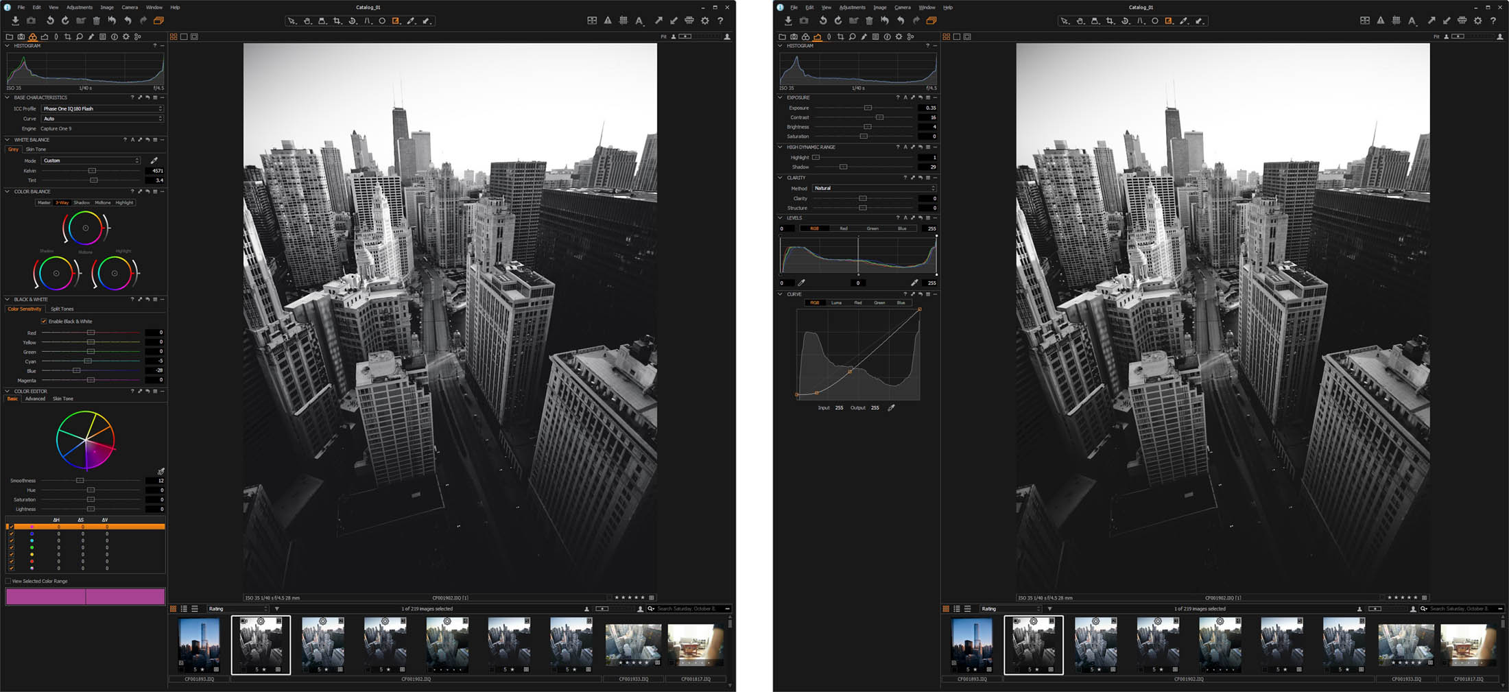
In the first example, we’ll make the photo appear a little more dramatic with deep creamy shadows and neutral mid tones. This will be done by using Curve adjustments and the Color Balance Tool. Small adjustments to both can have a profound result to your photos. The photo straight out of the camera is a little green, and the first thing I want to do is to correct the white balance. I tend to edit my work on the cooler side, but it’s more of a personal preference than being technically accurate.
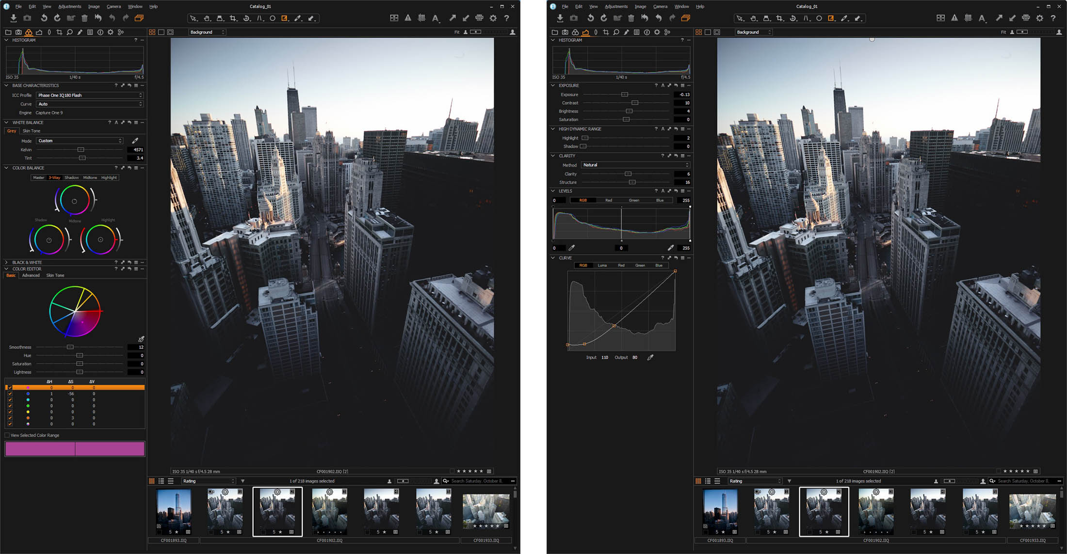
As you can see from my adjustments, I’ve made very minor changes using the Color Balance Tool, yet it has a nice effect on the colors of the photo. Perhaps the most important adjustment here is the shadows, which give a nice cool hue, combined with the Curve adjustments. I’ve also desaturated the blues in order to give the buildings a silver/grey look.
Creating a variation of a photo is an easy way to compare different edits of the same photo without losing your settings. To do this, simply right click the photo and select “New Variant” for a completely fresh variant without adjustments. Also, you can “Clone Variant” to make a variant copying the adjustments from the photo.
Version 2: Bright and clear
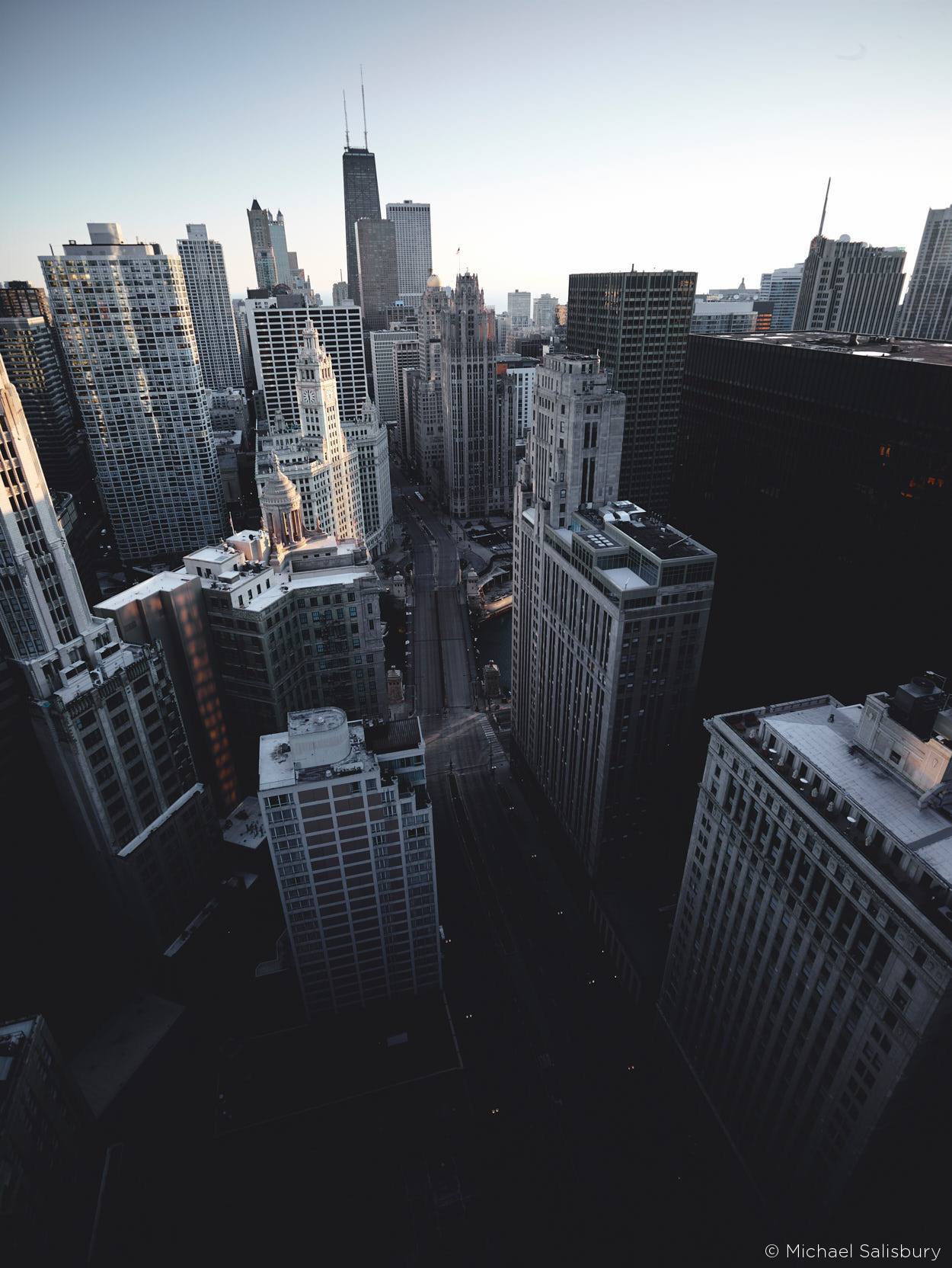
My next edit is similar, but with no adjustments to the exposure curve. By comparing this with the first picture, you can see how big a difference curves can have. I’ve also recovered the shadows and highlights to even out the exposure. After also cooling the White Balance down, I desaturated the blues a bit to give the buildings a grey/silver look.
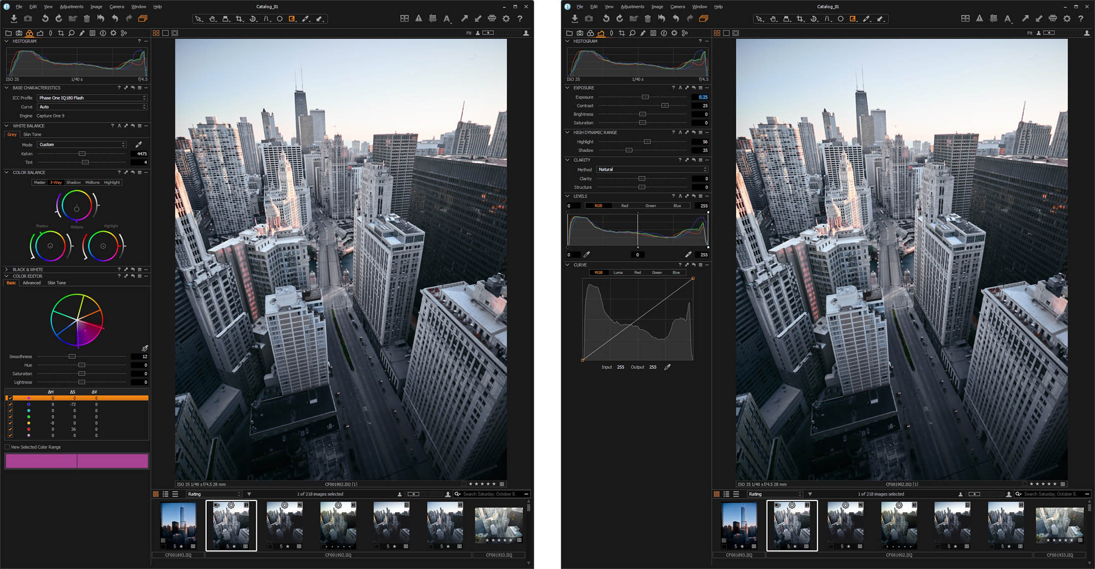
Comparing this edit with the original and first edited version, everything seems brighter. The mood of the photo is less dramatic, and has more of a natural feel to the image. The buildings no longer emerge from the shadows of the streets, but are more pronounced and clearer. This image represents more closely to what the scene looked like that morning.
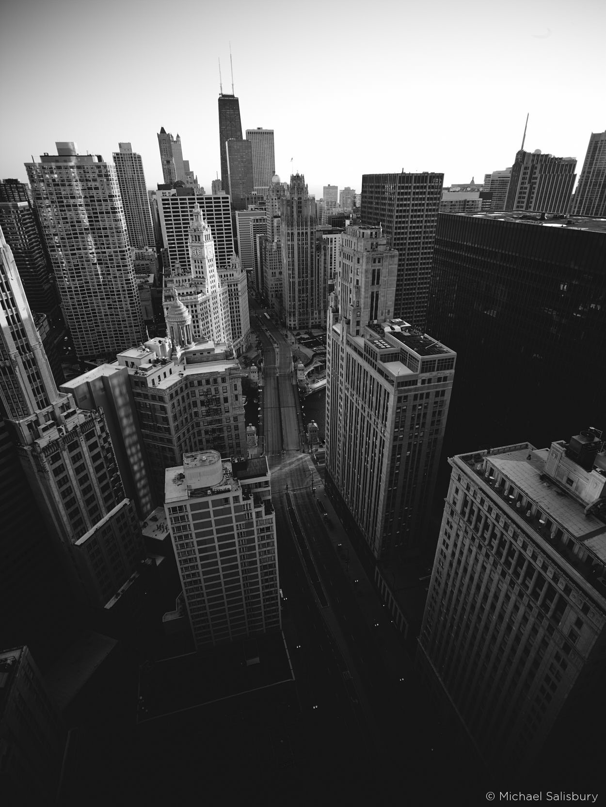
Version 3: Black & White
Lastly, let’s look into the Black and White tool built into Capture One. I kept the cooler White balance settings from the previous two photos, and then dropped the blues a little in the color sensitivity settings. This gives the photo a little more contrast. Moreover, I gave the shadows a slight blue hue under split tones to give the photo a little bit of a silver look to it. I’ve also copied the exposure curve adjustments from the first photo to again give the shadows a milky look to them.
Color versus B&W atmosphere
Choosing to edit in B&W is a choice that some photographers often struggle with. The most common question is: “When is it appropriate to do so?” Depending on who you talk to, the answer will vary to great lengths, but I always say that it depends on how the photographer views the scene. Personally, I think it provokes a different feel and mood altogether. The image, to me, is less distracting and more serene. It feels less busy. It’s hard to pull off B&W in architectural photography, but I think it works for this image.
The importance of Color Grading
Coloring your images can sometimes be an intimidating process. In a world where expensive filters and presets are becoming the norm, people seem to spend less time learning the tools at their disposal. Understanding how all of these tools fit together and change your images is almost an art in itself. Sometimes, you become a photographer and a painter at the same time, taking something straight from the camera and creating a whole new perspective on an image just through color grading it.
I hope you learned at least where to begin coloring your images, and explore other possibilities by putting your own spin on it. If you want to explore more of my work, you can visit my website.
Feel free to let me know which of the three versions fits your style the best, or maybe you have another suggestion?
Michael Salisbury
Michael Salisbury’s photography spans from architectural and interior photography to product and lifestyle photography, and he’s worked with clients such as Adidas, VICE, McDonalds, and much more. His photography has spread across blogs such as PetaPixel, FStoppers, Architectural Digest, and Colossal.

zdravstvuyte.Ranshe program very much, but I did not get to do so imports and exports, and to a lot of lost photos
Hi, I like what you’ve done with the images, especially the Bright & Clear version. However, the screenshots are low resolution at full size so the settings are impossible to see…
Mark, right click and download the image. Much larger.
Hi Mark,
Thank you for your comment. Glad to hear that you like Michael’s editing and are interested in the details!
The quality of the screenshots should be better now.
Have a nice day,
Best regards,
Camilla, Phase One
Perfect, thank you Kim.
Thank you Camilla, they’re much better now.
I like all the images but the B/W is my favourite, way back in my film days I stopped using colour and only took B/W for about ten years, since having digital cameras I have been stuck on colour but I just upgraded to the new Canon EOS 5d Mk4 and also started usingh C1 last year, it seems to deal with B/W much better than my previous software so I am watching and learning the art of B/W from photogaphers like yourself with great interest, it still has the knack of making you look at the subject without being distracted by the colour which often doesn’t seem to reflect reality, if that makes any sense. Nice images…..
These examples are very helpful in showing how to bring out the best in photos. Thank you!
I agree with Mark. As someone desperately trying to tackle the steep learning curve of Capture One, I was unable to fully comprehend the text because the screenshots were impossible to see exactly HOW the adjustments in the text were effected.
Hi Alan,
Thank you for your comment.
The quality of the screenshots has been improved, so now you should be able to get started editing with Michael’s adjustments. Enjoy 🙂
Best regards,
Camilla, Phase One
I don’t like cities. I do enjoy B&W. Your B&W resonates with me.
HI, I like this editing work very much, and I understand that the screenshots were improved. Would you have a video, or videos related this topic? Thank you.
Thanks for sharing this Michael! It’s not just the examples of colour grading that are very informative: your comments about how grading decisions form part of a personal style has got me studying others’ work to see what each of them does to set themselves apart.