
In the previous tip about color grading and the new 3-way Color Balance tool, Color grading made easy, I covered the basic functionality of the new Color Balance tool along with a quick look “under the hood” of the new tool.
In this post I’ll go much deeper, exploring the far corners of the tool, it’s more advanced application, and the design choices made to provide the users with a quick yet precise way of “grading” his or her images.
Algorithm design
Let’s start by investigating how this tool is different from the traditional Levels and Curves Tools.
First, as I mentioned in Color grading made easy, no knowledge of complimentary color interactions is needed to use the new Color Balance tool. You simply select the specific color you desire and increase the saturation and/or luminance until you have achieved the precise tone you want.
For toning, Levels have usually been the preferred way to achieve the desired look. Let’s take a look into how the Color Balance tool is different:
- Levels (and Curves): When adjusting the Blue channel, for example, and adding more blue to the shadows, one would increase the Shadow Output Level. Of course, this results in more blue, but it has the distinct side effect of lifting the overall luminance value of the shadows. Another side effect you’ll find is the Shadow output Level affecting more and more into the midtone values and eventually even the highlights. Avoiding this effect requires tedious curve point anchoring and adjustment.
- Color Balance tool: The new Color Balance tool works all together differently. If the Shadow wheel is adjusted, the adjustment will never affect the highlight, and will only affect the lowest midtones values to create a pleasing roll-off. However, the real game-changer is the preservation of the deep shadows. This retains a much higher detail level in the shadows, as the luminance is not changed in the deep shadows.
- The same principle applies, to some extent, to the Highlights. Here the tool retains the extreme highlight areas when using small corrections.
- The Lightness sliders provide a quick way of adjusting the luminosity of the selected value. This adjustment is applied with a limited impact on saturation, which is a different approach from both the Levels and Curves tool. These sliders can act as both classic input and output adjustments, depending on which way they are adjusted. The Midtone Lightness slider is particular interesting as it provides an impressive, and otherwise non-existent, Midtone Output slider.
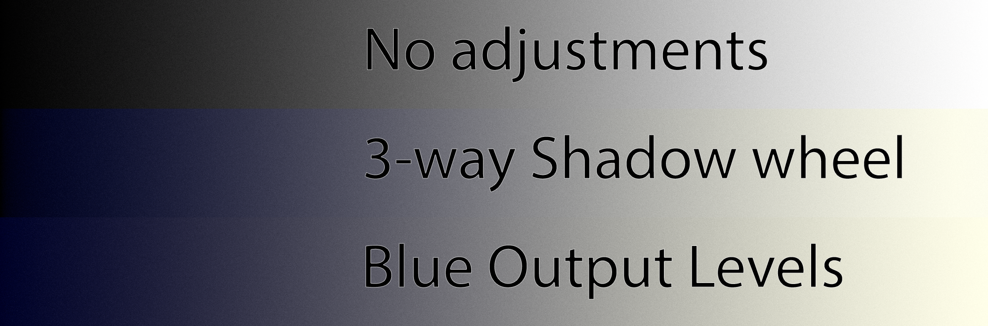 Illustration 1: This illustration on a black and white gradient shows the deeper shadows being preserved.
Integration with other tools and workflow
Retaining the deep shadows can of course be problematic if the “milky” look from the high Output levels is desired. In this case, after obtaining the desired color toning, increase the RGB Output Level and you have the same effect. However you will achieve much more individual control.
In general, the Color Balance tool is all about color and intensity, whereas Levels and Curves will also change contrast and luminance. Because of that difference, when using Levels or Cuves, a given image will need more adjustments than usual to obtain the same end-result and will likely be much harder to achieve.
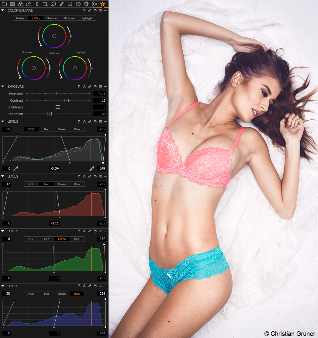
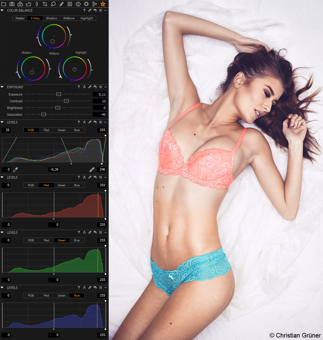
Illustration 2 and 3: This shows the same image, with the same look. Left is done with Levels, Right is done with the Color Balance tool. Notice the Saturation and RGB levels.
With non-destructive editing in Capture One, there is no “right way” of adjusting a given image. However, there are workflows and tools that can greatly minimize the time required to achieve the desired result and toning of an image. As an example, here is how I usually achieve my “look” and tone for a given portrait:
- Change the Base Characteristics: I start by changing the Film Curve to my liking. I usually prefer the “Extra Shadow” curve for most images.
- Increase and adjust global contrast and exposure using the Exposure tool, High Dynamic Range, Clarity and Levels.
- Use the Skintone Tool and Uniformity slider to dial in my desired Skintone
- At this point I am ready to use the Color Balance tool. I like to use tones that are already present in the picture as inspiration for the toning. That could be clothing, eye-color, background, props etc.
- When I am happy with the colors, I usually make a brief detour back to the exposure adjustments to fine-tune the image.
Improved editing speed using keyboard shortcuts
Since we’re talking about the time it takes to adjust an image, it’s worth noting that all the sliders on the Color Balance tool can be assigned to Modifier Keys.
With the right hardware, such as a Wacom tablet, or video grading wheels and trackballs, you can achieve the colors you want much faster.
I mentioned a few Modifier Keys in Color grading made easy. There is one more worth mentioning (Windows only), and that is the Alt-key coupled with mouse movement. Using this Key will dampen the mouse movement at ratio of approximately 3:1. This makes adjustments in the 3-way tool much more accurate, especially if you’re using a Wacom pen. Use the Wacom utility to assign and configure as you see fit.
With and Without the Color Balance tool
So what do images look like with and without the Color Balance adjustments? Let’s take a look at a few examples. Below each image set is paired with a black and white gradient showing the same toning applied. I’ve also included one gradient without any color adjustment for reference.
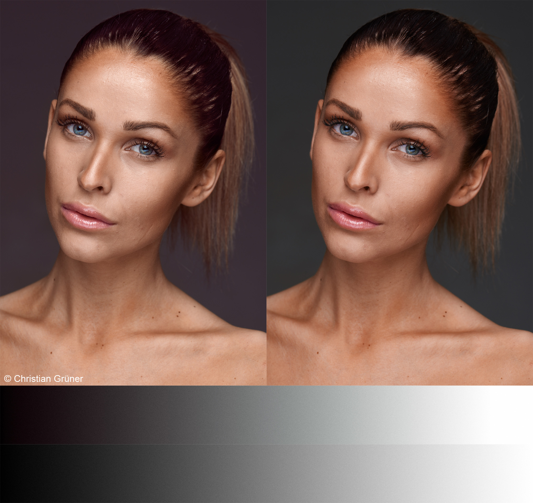
Illustration 4: With-Left. Without-Right: A red Shadow and a slightly green Midtone. Notice how the green Midtone also helps to correct for the red skin tone.
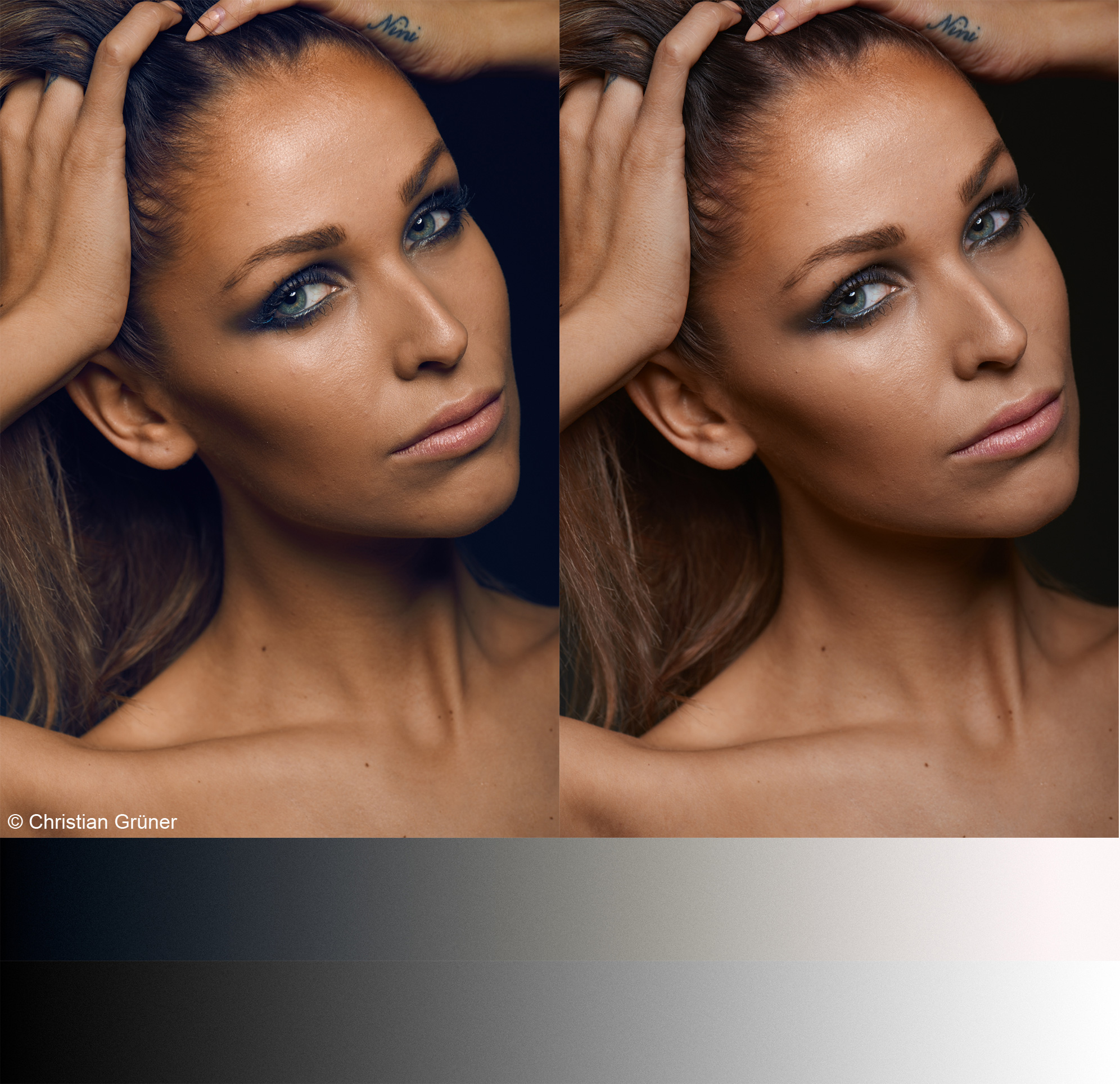
Illustration 5: With-Left. Without-Right: Blue Shadows, yellow Midtones and slight red Highlights. Notice that while the grading seems slight, it’s impact on depth and skintone is significant.
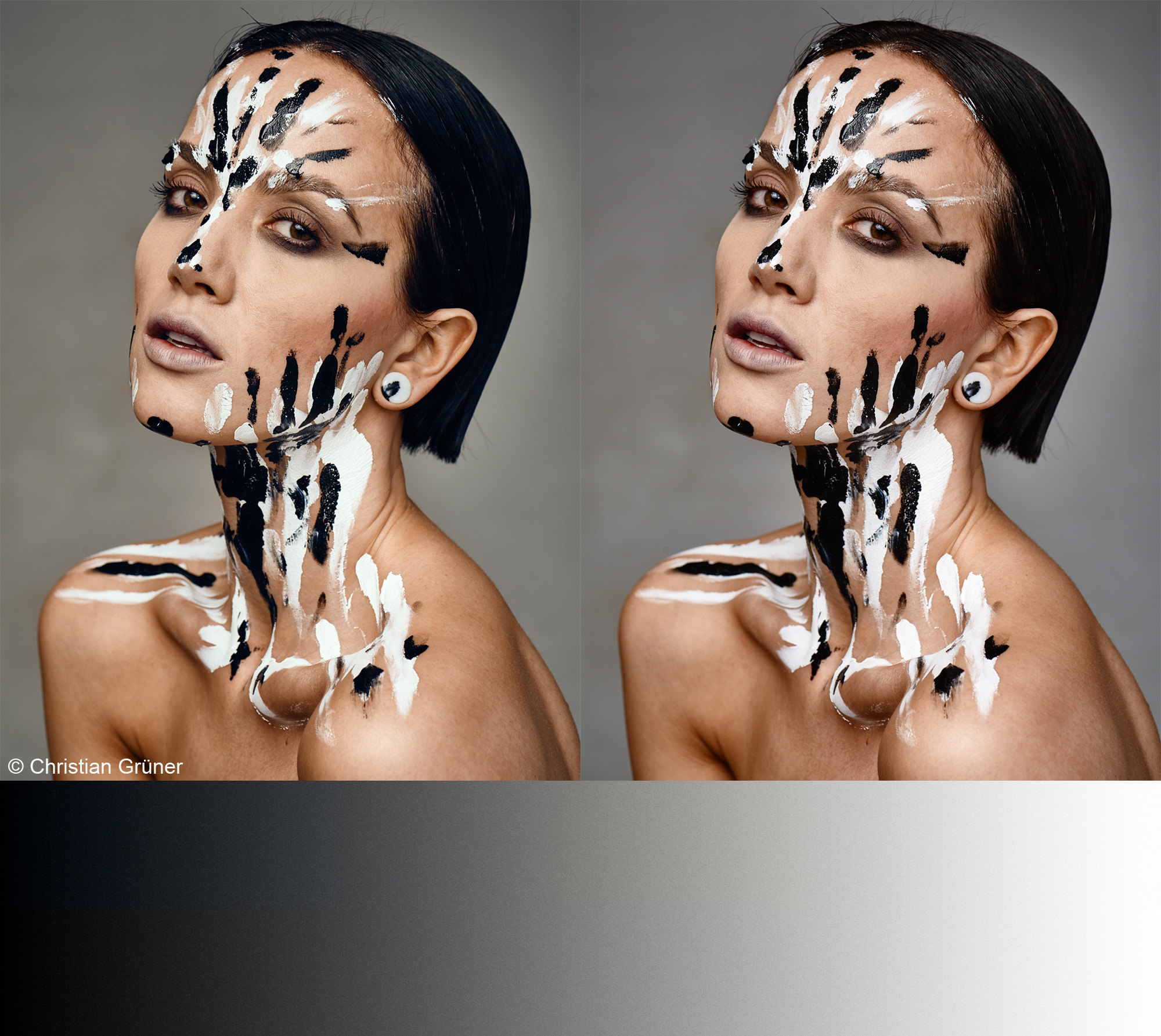
Illustration 6: With-Left. Without-Right A very subtle edit, blue Shadows and yellow Highlights. Again, though subtle, the little added warmth to JUST the highlights significantly improves the quality of the image.
With all these new possibilities, I’m happy to introduce you to my new favorite tool! The Color Balance tool makes toning easy and fast. Not only that, it also gives me more control over the final image for picture perfect results.
I hope you will enjoy the new Color Balance tool as much as I do.
Best wishes,
Christian Grüner

Christian Grüner
Christian is Test Manager with the QA/Test department in Phase One. In the very little spare time a job in Phase One gives Christian, you’ll find him shooting pictures, recording aerial imagery with pro-grade drones or trying not to crash on the mountainbike in the woods.
Dear Christian, is it possible to create a “orange & teal” look with the new color balance tool?
Thanks in advance
Ulrich
Hi Ulrich,
Absolutely! You basically just select the colors you want, and increase the respective saturation until you are happy with what you see. You could also lift the shadows a bit using the Lightness slider, or Levels Output.
//Christian
Thanks for your useful information about the new Color Balance Tool. You have given me more incentive to upgrade to the current Mac OS 10.10 (Yosemite). I am still using 10.6 (Snow Leopard) because the newer versions of Mac OS have no additional features that I can, or should, use, except for OpenCL. I am saving your web page as a PDF. Now that CO version 8 supports hierarchal keywords, I have no reason to stay with Adobe Lightroom.
Hi Warren,
Very happy to hear that. Remember, if you need any help, just contact our Support Team via this page: http://www.phaseone.com/en/SupportMain/ContactSupport.aspx
//Christian
I still have major misgivings regarding Yosemite… I am lucky enough to have a MacPro running OS X 10.8.5 ( a true powerhouse for creatives ) and another MacPro running OS X 10.10.2.
Capture One 8 seems to be great but again I’m still not comfortable with Yosemite for anything more then testing or non-critical work !
I too am concerned about using Yosemite. I have a Mac Pro running OS X 10.6.8. Sometimes I wish that I had stayed with Windows. With Windows, all of my Apps are in their own partition, separate from the OS partition. Then I could simply switch back and forth between the versions of Windows. But with OS X, for me to upgrade to Yosemite, It looks like I may have to reinstall all of my critical apps after I get Yosemite up and running. Have you customized any of your shortcut keys? Some users lost some of their application settings when they upgraded to Yosemite.
how do you get those to stay open at same time & the three levels ?
You can add the same tool more than once and have a different tab showing in each.
thanks Christian 🙂
03th April 2015
Hello,
unfortunately it is not possible to use the Color Balance Tool on Local Adjustments Levels.
Question ad Wacom Intuos 3: the hand tool doesn’t work with CaptureOne 8 Pro,
no problems with Photoshop CS 6.
What can I do?
Nevertheless, Capture One 8 is a great tool, but somtimes nervously like a spoiled diva, smily.
Happy Easter from Munich,
Wolf
Hi,
CO and PS doesn’t share all the same keyboard shortcuts.
My suggestion is to make a profile specifically for CO and map the shortcuts you want to the buttons on the Wacom.
//Christian
Will the shortcut with a Wacom tablet be available on the Mac soon?
Hi Tristan,
I’m not sure what exactly you mean. Can you please elaborate?
//Christian
Hi there.
I can use the right Click Button to get the pulldown Menüs
In capture One 8.0 sometimes it Workshop sometimes not
Can anybody help me
Regards Thomas
Hi Thomas,
Please write our Support Team: http://www.phaseone.com/en/SupportMain/ContactSupport.aspx
//Christian
Christian,
i am trying to find how to convert analogue to digital as per the image quality professors email of the 5.2.15 , The image quality professors blog link doesn’t work.
i want to scan colour negatives and convert.
Kind regards Steve
I’m really impressed by the new color controls. It makes it so easy to make your pictures pop – even the contemporary organge-teal-tone is just three clicks away…
Harald
Hi Christian!
Thanks for this nice tutorial! Is it possible to see the parts of the image, that will be influenced by the Shadow, Middletone or Highlight wheels in advance – similar to the way you can see the affected colors in the Coloreditor?
Thanks, Helmut
Thank you for implementing something that I (I am sure, like many others) had suggested. I have another suggestion: it would be great if you could create an adjustment mask based on the focus or highlight mask. For example, if you have a shot of a flower in sharp focus with a busy background out of focus, you could use the focus mask to create an adjustment mask of the flower and then darken/etc the background. Equally, it is very often when HDR tool is not enough for high contrast shots and an adjustment mask needs to be created to make further adjustments; in those situations it would be great to be able to transform the “Exposure Warning Mask” into an adjustment mask.
Regards,
Erik