In order to get very precise color reproduction it is of course important to use a grey card. Most cameras give a pretty good Auto White Balance though, which can be very useful in a lot of circumstances where precise colors are not that important – e.g. in landscape photography where it is often more about expressing a mood.
Another benefit of shooting RAW
Among the many great benefits of shooting RAW files, the ability to change the White Balance in an image after it has been shot, is probably one of the most important features. It’s only possible to change the White Balance the right way when you are working on a RAW file.
The White Balance Tool and the Color Balance Tool in Capture One Pro 7 give you two tools for working with the White Balance in an image and the ability to recreate the original color balance of the screen or just create a whole new color balance.
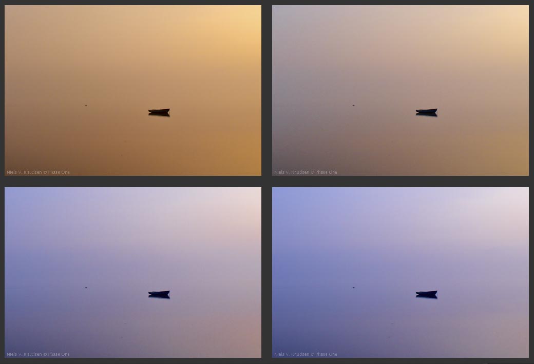 Four different versions of the same image. The only difference is the White Balance. It is easy to see what a big difference, it makes to the overall expression of the image.
Two tools for tweaking the White Balance in an image
On the Color Tool Tab in Capture One Pro 7 you find the White Balance Tool and the Color Balance Tool. Both tools only change the White Balance of the image, which simply is a matter of changing the overall ratio between the red, green and blue component of the image.
You can basically do the same thing with the White Balance Tool and the Color Balance Tool, but they have a very different user interface approach. They each have their own strengths.
White Balance Tool:
Let’s start with the White Balance Tool. For landscape images I typically use the Camera Auto White Balance or a custom daylight balance in my camera. So I won’t need to use the White Balance color picker and a grey card shot to establish a good starting point for the White Balance.
 The White Balance Tool will show the method used for White Balancing the image and it will also show an approximated Kelvin and Tint value matching the selected mode.
Typically an Auto White Balance will not give you the same as if you are making a click balance on a grey card. If you for instance are shooting in the warm yellow sunlight around sunset, a click balance on a grey card will fully remove the warm tone in the image. An Auto White Balance on the other hand will balance the light, but it will keep some of the warm look.
So if you compared the Kelvin and Tint values in two images where one was made with a click White Balance on a grey card and the other by using Auto White Balance you will get different results. Only the click balance will give you approximately the right kelvin temperature of the light.
If you want to change the White Balance you can just drag the Kelvin and Tint slider. If you by accident have set your camera to a totally wrong White Balance settings for instance like “fluorescent” for a landscape image, you can use the Kelvin and Tint values to guide you to a setting, which would be a good starting point for optimizing the White Balance. So if you have been shooting in daylight, then set the Kelvin between 5000 – 6000K and the Tint near 0. Remember the Kelvin read-out is a guide and not an exact Kelvin measuring device.
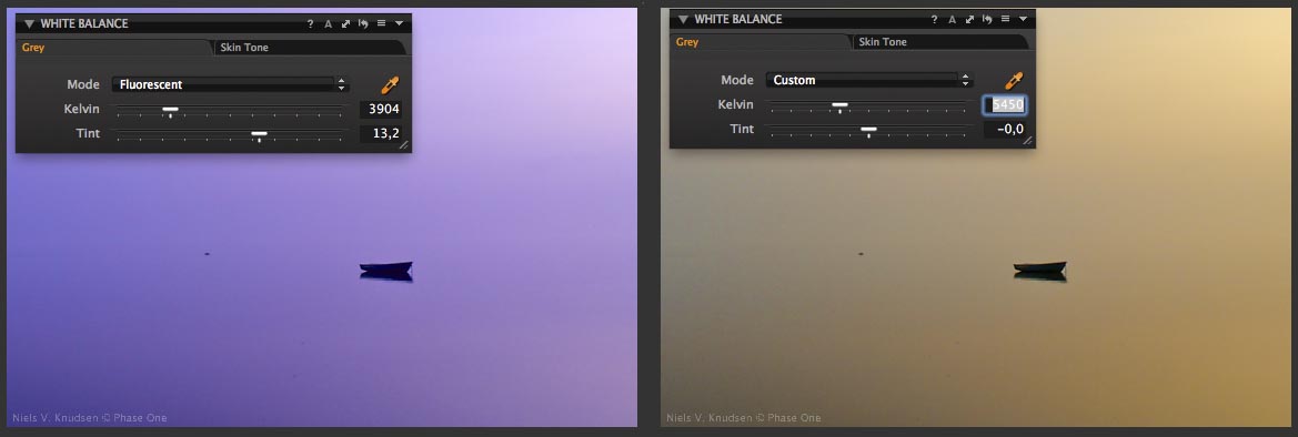 The left image shows how the image would look if the camera White Balance accidently has been set to” Fluorescent”. In the image to the right the Kelvin slider has been dragged to 5450K and the Tint slider to 0. This is a much better starting point for a neutral White Balance for the image. The slightly greenish cast can be removed by fine-tuning the Tint slider.
Using the Kelvin and Tint slider
Quite small changes in Kelvin temperature lead to a quite different color appearance. Typically when dragging the Kelvin slider to achieve a certain look, you will also need to fine-tune the Tint slider. Working with the Kelvin slider you basically change the image between a blueish look and a yellowish look, which will give the images a colder look or a warmer look , which is something that can add value to an image.
The Tint Slider adjusts between a greenish look and a magenta look. Often you use the Tint slider to minimize unwanted color tints in your image.
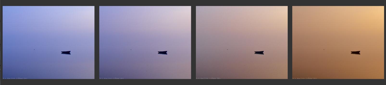 4000K 4400K 5200K 7000K
Above is the same image, but with four different Kelvin temperature settings in the White Balance Tool. They are very different but still very nice and still realistic versions of the image. The image itself hardly contains colors so it gives you quite a large range of possibilities for crating your own look.
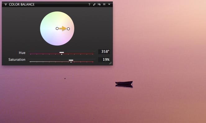
The Color Balance Tool
With this tool you can achieve a specific look in one simple operation by simply dragging the White Point (center circle) to a specific color toning. Once you have your desired toning, you can use the two sliders to fine-tune the look.
The Saturation slider increases or decreases the effect of the toning. With the Hue slider you can fine-tune the color toning.
 With the Color Balance Tool I have dragged the center white point to a more reddish tone.
Every time you make a click White Balance, the tool will reset and set the white point in the neutral center of the hue circle. Moving the white point in the hue circle will now tone the white point to the specific color in the hue circle.
The tool has some very useful presets to create a warmer or a colder look. I will strongly recommend you to try out these presets. It is an easy way to get to a good starting point for a specific look, but you can also create your own preset.
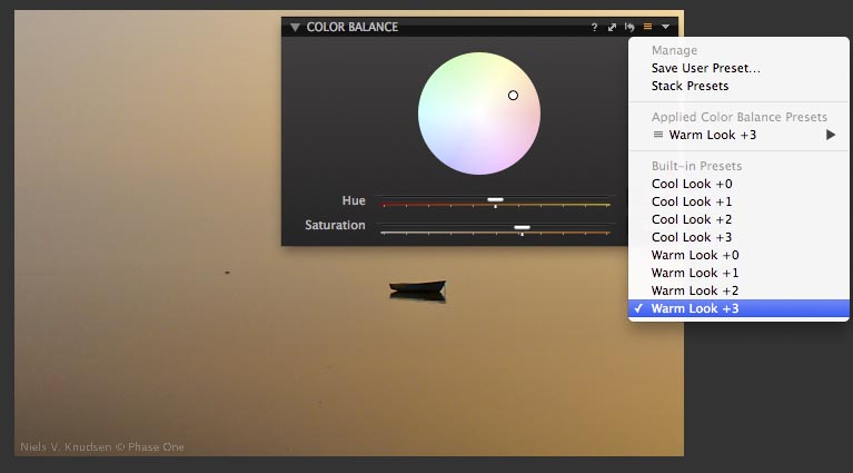 The preset Warm Look +3 has been selected. The difference between the +1, +2 and +3 is only the saturation of the new white point in the image.
A great benefit of using the Color Balance Tool is that you can easily achieve the same look independently of the real color temperature of the scene or independently of what camera you are using as the Color Balance Tool is an adjustment to the already established White Balance.
All the best,
Niels

The Image Quality Professor
The digital pioneer, Niels V. Knudsen, is Phase One’s Image Quality Professor and founder of the IQP blog. Moreover, he is responsible for breakthrough advancements in image quality both in Phase One’s medium format camera systems and in Capture One Pro.

ok grazie x suggerimenti saluto enzo corti
3487150862
Hello Enzo,
No problem. Thanks for your feedback.
All the best,
Niels
Hi Niels,
I have a question:
Does the color balance tool just move the white point of the image or is it working similar to the “Photo Filter” adjustment layer in Photoshop?
http://stackoverflow.com/questions/3432498/photoshop-photofilter-pixel-math?rq=1
Thanks!
– Cameron
Hi Cameron,
It is just relative to click balance and default White Blance. The color balance is just another way of changing the White Balance in the image.
All the best,
Niels
It might have been better to explain what colour temperature is and what causes it to change before explaining how to compensate after shooting.
It’s not obvious why the colour of an illuminant is expressed as a temperature.
Someone who was hoping to learn something about colorimetry would be none the wiser after this.
The photograpic examples were very poor, giving no guidance regarding what might be better or worse.
Hi John,
Thanks for your input. I will take it into consideration when writing future blog posts.
All the best,
Niels
Great tip . Simple and creative .
Sometimes we forget the power behind a basic tool . Your article remind Us about this.
Hi Fabio,
Thanks for your kind words. Good to hear that you found the tip useful.
Br,
Niels
Hello Niels,
nice to read this.
I like Capture One, because for me its professional, intuitive and fast in my workflow!
But the WB is sometimes difficult to manage.
I often have to correct the WB manually, though I used a grey card…
E.g. Lightroom Users can work with Color checker and load a profile from it.
Does this mean, that I can manage the WB with this tool in a better way?
Can I import a Color checker profile also in Capture one?
Alternative?
Greetings
Alan
Hi Alan,
Good to hear that you enjoy working with Capture One.
Regarding your question: It is not possible to import a color checker profile into Capture One.
The color balance tool is definitely an alternative method to fine-tune your white balance.
All the best,
Niels
Hi Niels,
One of the reasons I recently bought Capture One was because of the extended Kelvin scale – it goes way lower than the 2000 that some raw converters have as their lower limit. This is really important for infra-red photography.
Could you tell me how to make a white balance correction using an average of the entire raw image?
Regards,
Dave
Hi Dave,
Sorry for the late reply. Just recently got back from France.
Personally I always do a click balance and then afterwards remove saturation in the Exposure Tool.
All the best,
Niels
Slightly at a tangent to this – is there a tool like the mid grey dropper in Photoshop curves that will give a balance based on setting the point clicked to 128,128.128?
I can’t find an equivalent.
Hi David,
There is no such tool in Capture One. Thanks for your question though.
All the best
Niels
Thanks Neil.
Perhaps something simpler then? Can you suggest a quick way to just set a specific spot to neutral (R=G=B) without defining a specific value?
So, for example, in an image I might have an area of value 120, 135, 99 that really should be neutral. What would be the quickest way to rebalance the whole image by adjusting that area to something near an average of those values but such that all 3 channels had the same brightness (so around 118,118,118 in that example)?
This is not a comment, but rather a question:
Will there be lens support for Zeiss lenses (for Canon), and if so when to expect?
best regards
ole
Hi Ole,
We are constantly increasing the number of lenses we support. These are on our lists.
All the best,
Niels
Thank you, very usefull and clear, as usual;-)
Regards
Lili
White balancing by picking (clicking on) a white area (bright white snow in this case) seems to work well, if the Rendering Intent in the color preferences is set to “perceptual”. It is not working well (= snow has a hue) when another Rendering Intent is set in the preferences (absolute colorimetric).
Shouldn’t it be working regardless of the setting of Rendering Intent, or am I missing something here?
The setting “absolute colorimetric” gives me a more natural (warmer) tint of green/yellow grass in the viewer as well as in the exported jpg’s.
P.S. Sorry I forgot:
“Thanks and regards,
Marc”
maybe a silly question but….
if daylight (cooler colour) equals about 5600k and tungsten (warmer colour) 3000k
why does the kelvin shift on C1 get warmer the higher the number and cooler with a lower number?
Hi Valerie,
Because the value you are setting is describing the colour temperature of light at the time of capture.
David