
Explaining structure is a hard task and better demonstrated with the right image. I have tried to explain it before in earlier blog posts but I believe this image is perfect for showing the enhancement that a structure adjustment can give.
This is a lemur, right?
Due to my recent faux pas with the robin and chaffinch mix-up, I am using an animal, which I can confidently identify! Therefore I hope I am right when I say this is a lemur?
As well as using Structure to really define the fur and make it stand out, I used quite a few Local Adjustment layers along with an obvious Black and White conversion
The unadjusted file was nearly passed over, but I am glad I spent the time to produce the final image.
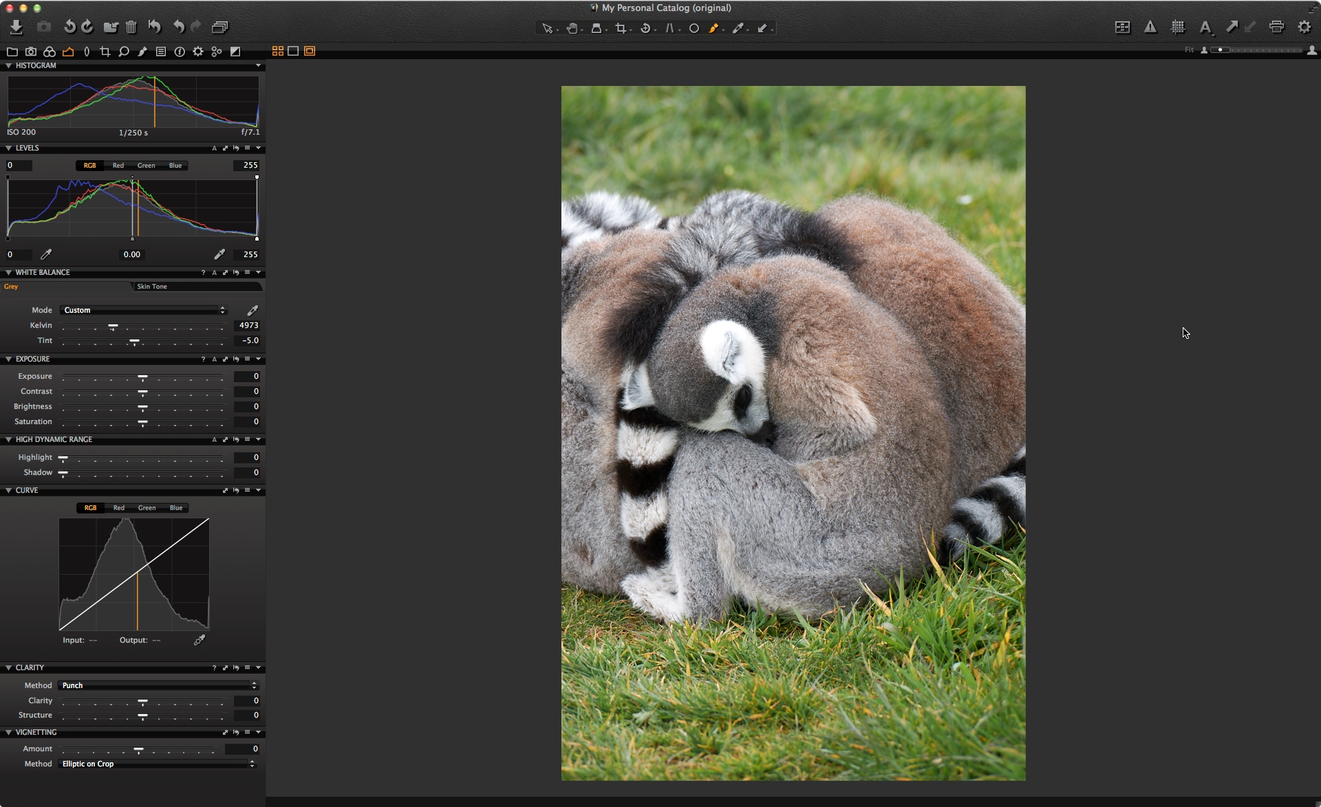
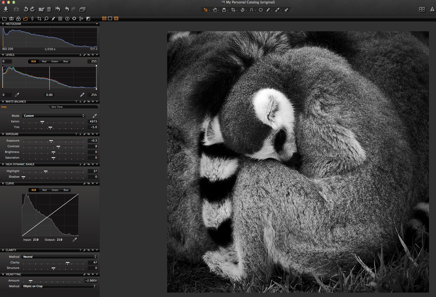
The Original
As I said, I nearly missed the original image. The crop is not particularly interesting and the lemur is not standing out so well from his other friends in the huddle. I think when I took the shot I somehow expected this to be the case.
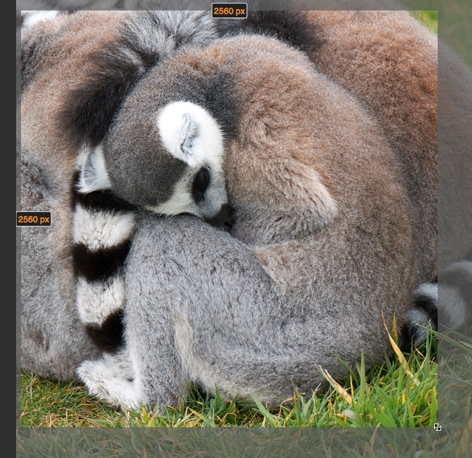
 Before making any adjustments I tried to see if a better crop could improve things. I felt that a square crop could work in this case, so I chose the Crop Tool and defined a 1×1 Aspect Ratio by clicking and holding on the crop cursor icon.
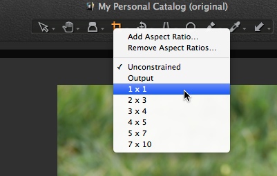 This makes it very straightforward to get a square crop.
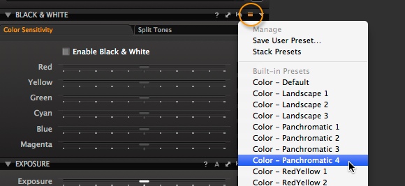
 I figured that the crop helped the composition quite a bit, so decided to move on with some adjustments. I immediately thought that a Black & White image would work nicely, so I used the excellent Black and White Tool in Capture One Pro 7 to do the job. I normally start with one of our factory Presets and settled on the ‘Panchromatic 4’ Style.
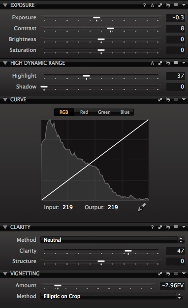
 I treat this as a starting point for further adjustment. Next I made some adjustments to the basic tools in the Exposure tab as you can see here.
 It’s getting closer but there are some brighter areas which I think are a little distracting. For example, the white fur around the ear and the left leg. Even though I have a pretty strong Vignette on, I still think the top part of the image could come down a little. And of course, we still haven’t exercised Structure to bring out the full potential of image detail.
 Therefore, this is a great opportunity to use some Local adjustments.
To tackle the brightness of the top part of the image, I’ll use a simple Gradient Mask (The Gradient Mask Brush is circled on the left) and draw from the top of the image down.
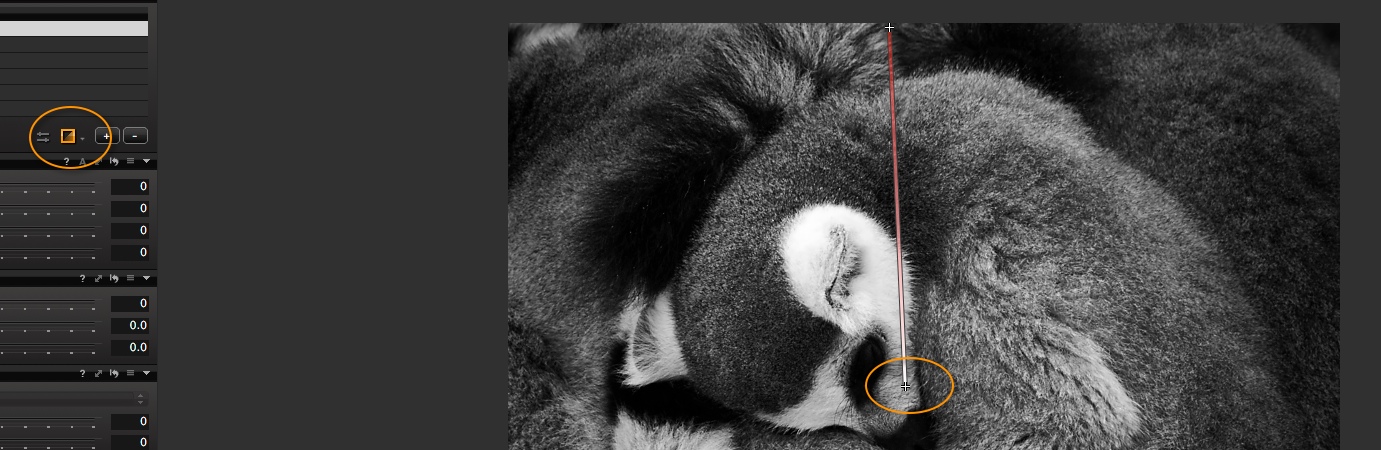 This gives the perfect mask for bringing down the exposure in just the top of the image.
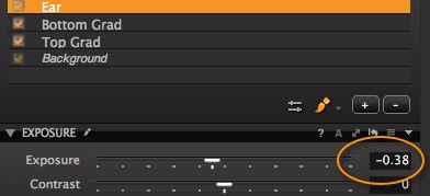
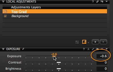 I find it helpful to rename the Adjustment Layers in case I want to return to them to adjust later. Just click on the name to edit it.
I also added another gradient mask at the bottom of the image to bring the exposure of the grass down a little more. (not shown here)
Most importantly, I felt the ear fur was a little too bright, so a quick dab of the Draw Mask brush and a reduction in exposure fixed that.
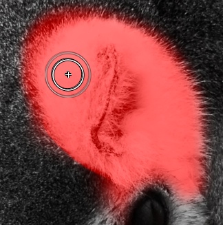
I added a final Local Adjustment to the eye, just to brighten it up a little. My Adjustment Layers palette ended up looking like this.
 Now we get to the all important Structure Tool, which I will add to the Background layer.
To try to explain Structure, think about this analogy. Consider an image of a tree and you have the option of using Clarity, Structure and Sharpening.
Clarity will enhance the tree trunk and the large branches
Structure will enhance the smaller branches and leaves.
Sharpening will enhance the structures on a leaf itself.
Hopefully the analogy will help you to think about what Structure can do for your images. If we compare the lemur on the left (Structure set to 40) with the one to the right (Structure set to zero) you can quite clearly see what Structure is doing in this case.
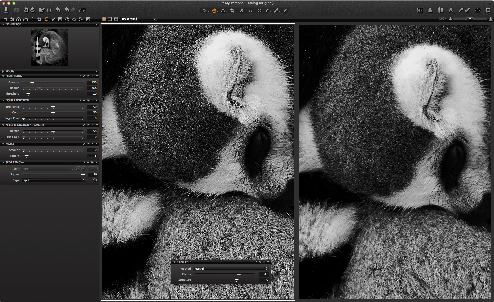 Structure really helps to bring out the details of the fur in a way that applying extra sharpening might not. If I was going to print this image out I could probably push it a little more. It’s worth experimenting with the level of Structure you can apply for your own needs, whether it’s for screen or print.
Here is the image also in color. What do you think works best? 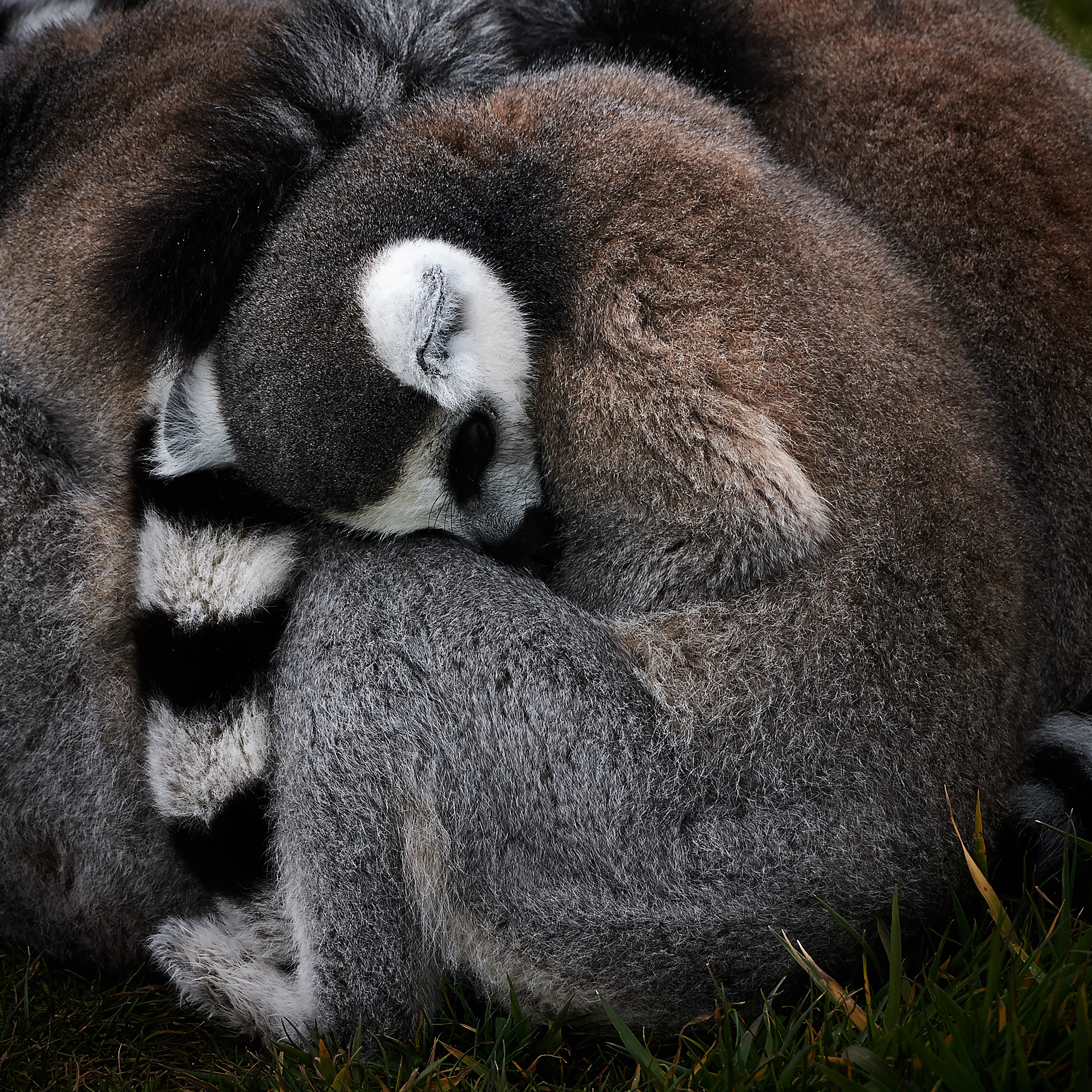
Best regards,
David


Hi David
Great little tutorial on a subject (structure) which I obviously haven’t been utilising well, or properly. I use clarity often, in moderation, but the structure was a bit of a grey area, this explains it well and I’ll begin to use it more now.
This is genius:
Clarity will enhance the tree trunk and the large branches
Structure will enhance the smaller branches and leaves.
Sharpening will enhance the structures on a leaf itself.
Thanks
John
Thanks John!
Glad it is helpful. 🙂
The Tree analogy I have to compliment Niels (The IQP) which he gave to me sometime ago. Its a great explanation.
David
So… Structure is akin to a USM with low radius setting(say 1) and a high Sharpening Amount?
(In the same vein ‘Clarity is akin to a USM with high radius and a low Amount setting? [I know that Clarity abreviates the mid tonal range contrast]).
Hi Mike!
Mmm not quite! Its not following the same maths as USM.
Best advice is to simply try it on your images.
Clarity is not Akin to USM at all. There is no sharpening process in Clarity, just midtone bump as you describe.
David
I’m trying to save an aspect ratio of 803 × 237 px so it will save me time cropping and sending the images to use for my website.
If i click add aspect ratio and name it My Website Ratio is it possible to after importing an image release this ratio on the selected image?
Thanks a lot for all the great info! Regards M.
Hi Marco,
Yes, just choose ‘Unconstrained’ again for the crop ratio.
David
Hi David,
Thanks for your hints. I did never use those tools, partly because Clarity used to burn highlights (this is not the case anymore, bravo!) and because there is no information around about the radii involved, which reduces control on the tool. Your analogy with the tree is enlightening and I could check it easily on a picture.
This raises my interest for Clarity and Structure. Yet, there are still only two scales, at which the user can enhance details. Instead of using just two radii, a ‘smaller’ one and a ‘bigger’ one, called Structure and Clarity respectively, the program could propose a slider to the user,
– to adjust the radius of the effect to the size of the details to be enhanced
– to adjust the radius to the resolution of the sensor used (presently, Structure is just not the same tool with 18, 24 or 64 Megapixel).
A very good point is that the tools can be used with masks in the Local Adjustments tab. This allows not only for masking but also for using the tools several times, which opens new possibilities:
– to enhance details at various scales
– to enhance details on various segments of the picture
This is not an invention of mine, it comes out of my experience with other software.
So, it would be really worthwile to give the user the capacity of selecting precisely the scale at which he enhances detail.
This being said, I like working with Capture One.
Reto
Hi Reto,
Thanks for the comments Reto.
David
hi,
I am shooting with canon 5 mark 3 ,
I have question about Curves in capture one.
1.There is built in pre- set in curves – Contrats.
I wonder why that pre set curve doesn’t look like normal s curve in photoshop – which is
the “standard” way to add contrast .?
2. I wondering how to get this kind of yellowish /greenish look in capture one ?
http://www.streeters.com/artists/photographers/boo-george/editorial
Hi Timo,
Well, I guess there is no such ‘standard’ why to apply things in imaging and this is our own interpretation. It is just a suggestion and you should fine tune the curve setting to your own preference.
As for the look you mention, you could try..
1. Manipulating the individual channels in the Levels or Curve Tool
2. Try using the Colour Balance tool to push the hue and saturation in a particular direction.
David
PS. Nice work on your website Timo!
Can you elaborate a little on when to use (+) structure combined with minus (-)clarity. I have found this combination useful in certain art repros.
Hi Tom,
Unfortunately it is not a technique I am aware of so can’t really comment.
What’s the purpose of such correction?
David
Hi David, Thanks to share ur vision.RK BAKSHI frm INDIA
Thanks RK!
Good topic. Very interested in sharpening vs. structure and I’m afraid the analogy example didn’t help me. Have you got another way of comparing. I think there is also the issue of most clients don’t want their images sharpened in photoshop by photographers. Is Capture One sharpening different from Photoshop?
On the subject of sharpening, I am not sure if I would let anything out of my sight without some kind of sharpening on. Even if it is only a touch to achieve photographic sharpness. Of course it is hard to know how much to actually apply if you don’t know the output medium or size.
Capture One follows similar principles to PhotoShop but you could argue that applying sharpening to the RAW file is better than a processed output.
Do you have anything further you can add on the subject of structure vs. sharpening in terms of how to differentiate their applicability to a situation. I actually used structure to “sharpen” a tabletop still life image recently that was a tad on the soft side in the background and was pretty pleased with the results. Would sharpen have been a more appropriate way to go?
I think you have to take I to account the output. I only ever apply a very conservative amount of sharpening as most of my work goes to print, and the printers always have their own sharpening algorithms that apply to soecific printing machines (dot pitch, stock used). Just as they have profiles for conversion to CMYK. For these reason I supply lossless files in Adobe 1998 RGB colour space at 300dpi with the stated sharpening.
Of course for web it’s an entirely visually led decision. Whatever looks good on screen, bearing in mind the lowest common denominator: Internet explorer: Although to be honest anyone who views images on Ie deserves the awful renditions they get 😉
Exactly John!
Hi Randy,
See John W’s comments as he makes very good points there.
Remember that Structure is not a substitute for sharpening. Some subjects will benefit little from Structure where as all subjects will benefit from some degree of sharpening (unless you want them to be intentionally softer – i.e. portraiture on occasion).
I think the best way is to pick an image and view the differences by adding structure, adding sharpening and a combination of both.
David
Thanks, David. Excellent tips, wish PhaseOne would incorporate them into the CaptureOne help menu.
Your final image, in color, surprised me. As you. I felt going to B/W was a good suggestion to start working on the image. “Seeing” in B/W is quite different than color, and in many instances you are forced to deal with shapes and forms in the image before working with the color adjustments. The final color image, however, is fantastic. See in B/W and adjust color last.
Hi Bob,
Yes. When I started with this image I was intent on that it ‘should’ be Black and White. But after going back to colour I am not so sure. I think I am starting to prefer it!
David
Thanks a lot for all the tips;
as far as I am concerned I don’t use “sharpening “tool anymore, I put it on zero level and use only “structure”, for my great satisfaction with “clarity” from time to time.
I am an amateur and I love Capture which is almost perfect in my opinion; one regret perhaps?I would welcome “noise reduction” inside the tool ” local adjustement”.
Best regards
Lili from France
Thanks Lili!
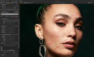
Structure introduces some strange texture in skin….
I would not suggest increasing Sturcture with skin.
If you want to apply structure on other areas of the same image, then use a Local Adjustment mask.