
In our workshops we often show people how to set colors using only the Levels tool. For many it is an awakening experience. For us it is the most natural and yet powerful method of manipulating color in Capture One. We like to think of it as a selective White Balance tool. Let’s dive into the details.
The very first step in our post production workflow is to analyze the image and try to decipher what it means and what we want it to mean. How our eyes perceive it, what parts of the image we want to draw attention to and which colors will represent the emotion in the pose and story.
These first thoughts give us a base and a direction towards which we will start manipulating the image, taking into account any comments from the client.
At this stage we very often turn to the Levels tool, which we think is the most underrated tool by the majority of users.
Calibrating the white and black points
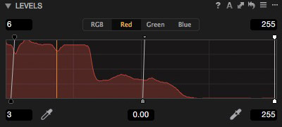
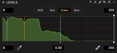
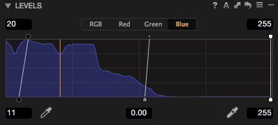
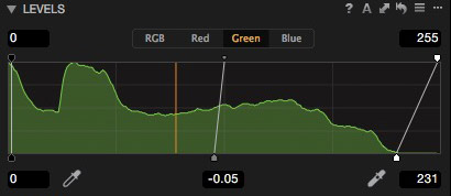
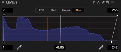
There are many ways to use the Levels tool. The most common might be to calibrate the temperature of blacks and whites in a shot. For example if we were to leave the white balance off and try to correct it using only Levels, we will get to a very different spot.
As long as the changes we make are not too strong and only delicately adjust the temperature of the shadows and highlights to our liking, nobody will even tell that such an adjustment has been made. Here I wanted to make the blacks colder and give the highlights a less yellow and more magenta look. From left to right is the RAW and the corrected image.
All it took was moving a few points on the red and green channel. The correction is marginal yet visually appealing.
Limiting for safer output
Another standard usage is limiting the maximum RGB values. What we gain through such a manipulation is a file that will be much safer when being used in a wide variety of media (which we will have no control over). If your image ends up on anything from smartphone to wall-sized print all over the world it is often a good idea to limit the whites and blacks assuming it does not harm the look of the image.
Of course we do not want a dull-looking image, but on the other hand harsh cut-offs from over-contrasty regions might be just as harmful. Just as in life, retouching to a “golden mean” is often the best solution.
If contrast is reduced too much by such a correction, then we can still try to regain it by increasing individual channel contrast and still benefiting from the safe highlight and shadow limits.
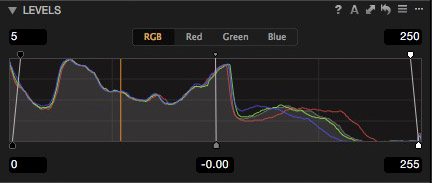
Strong toning
Although it is very easy to achieve quite unrealistic color by changing the value of endpoints of separate color channels, the outcome to us usually looks quite analog especially in comparison to the 3-way Color Balance tool, or strange white balance settings. It is often a good idea to make these color adjustments taking into account the colors of objects, which are in the frame.
Here are a few stronger color-toning examples made using only the Levels tool. The first one again being the ungraded RAW image.
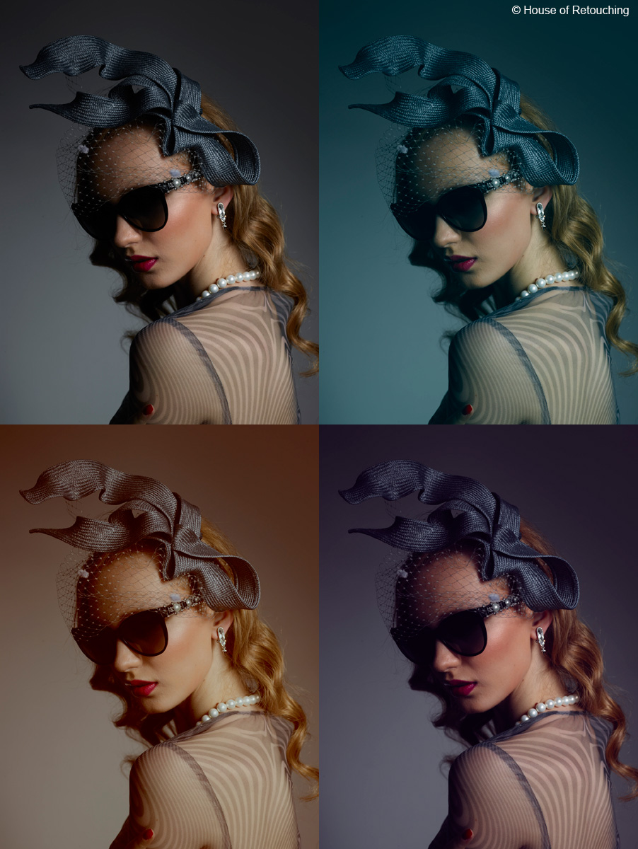
Of course in the examples above it is obvious that the colors are off, but does it look artificial or plastic? Color preferences are absolutely subjective and yet the vast majority of people tend to accept strong grading effects done by the Levels tool quite easily, if they are done with taste; I dearly hope this will be the case here.
Grading
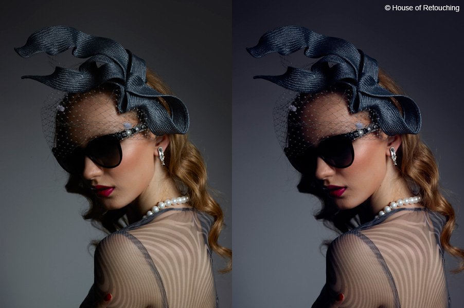
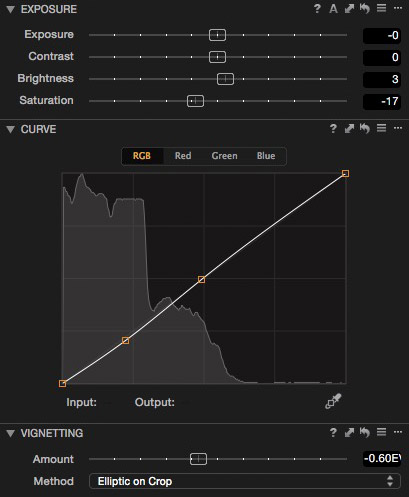
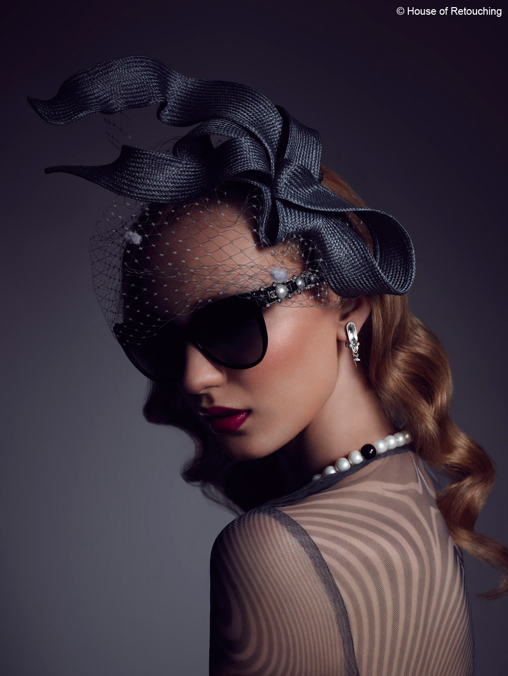
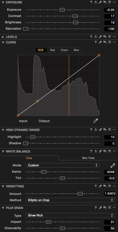
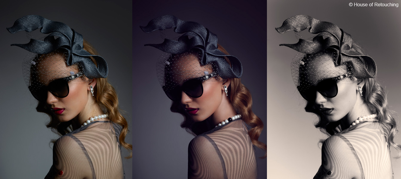
Let’s now compare how much of the style, which we set in the end for this image, was done with the Levels tool and what other things we decided to alter in order to fulfill our vision. Underneath on the left only Levels are applied, on the right also other corrections. The photograph in this state is ready for processing and then on to our retouching workflow in Photoshop.
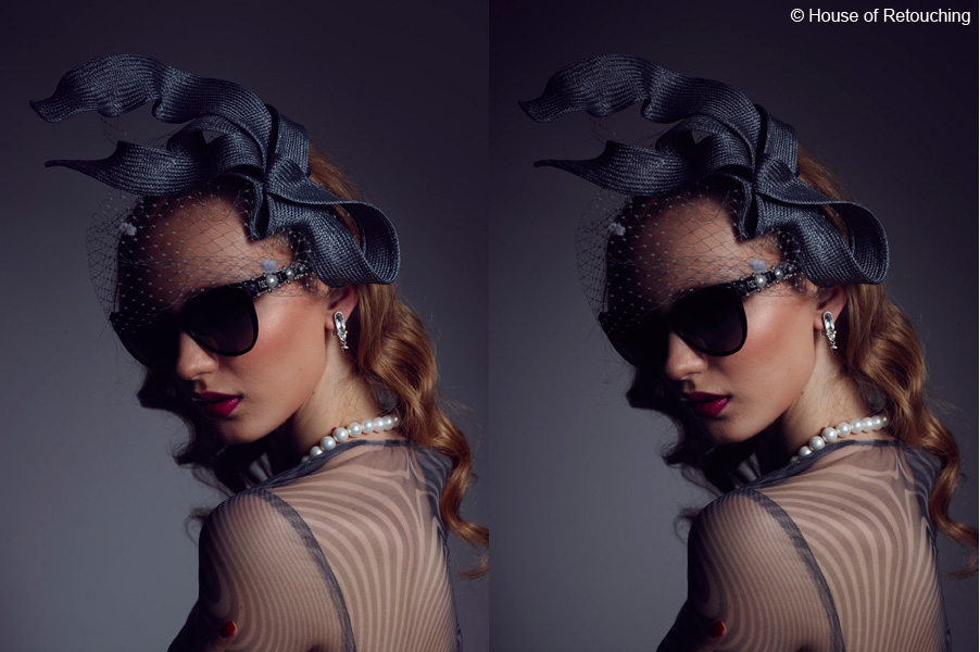
It is obvious that the majority of the look of the image was done in Levels. Here are the settings:
We left the highlights untouched in this case and concentrated on giving the blacks proper density, so as not to only shift color. The brightness and contrast also change while playing with endpoints. This gives Levels a different effect to the 3-way Color Balance tool, which was specifically designed not to affect contrast. The algorithms for both tools are thus very different producing different looks – which one works best is matter of taste however we feel most at home with the classic look from the Levels.
Other corrections applied were brightness and desaturation, a slight curve, and vignetting.
 And here is the image after retouching.
Looking at it from a grading point of view, the change done in Photoshop is marginal. The vast majority of the mood was created before processing and this is the reason why we put such a strong emphasis on proper grading in Capture One.
When working from the RAW file we have access to a very broad range of information (in this case it was 16bit RAW from the magnificent Phase One IQ280 digital back), and so the information is much more flexible. This approach of getting color right in Capture One has proven to give us better quality than when grading in Photoshop.
Black and white grading with Levels
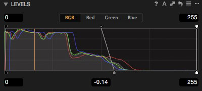
Let’s now look at another direction into which the image could have gone. We are big fans of doing black and white directly in Capture One. There are endless looks you can create when working on the RAW file. In this example we will again work with Levels in order not only to alter brightness and contrast, but also to add toning to our image.
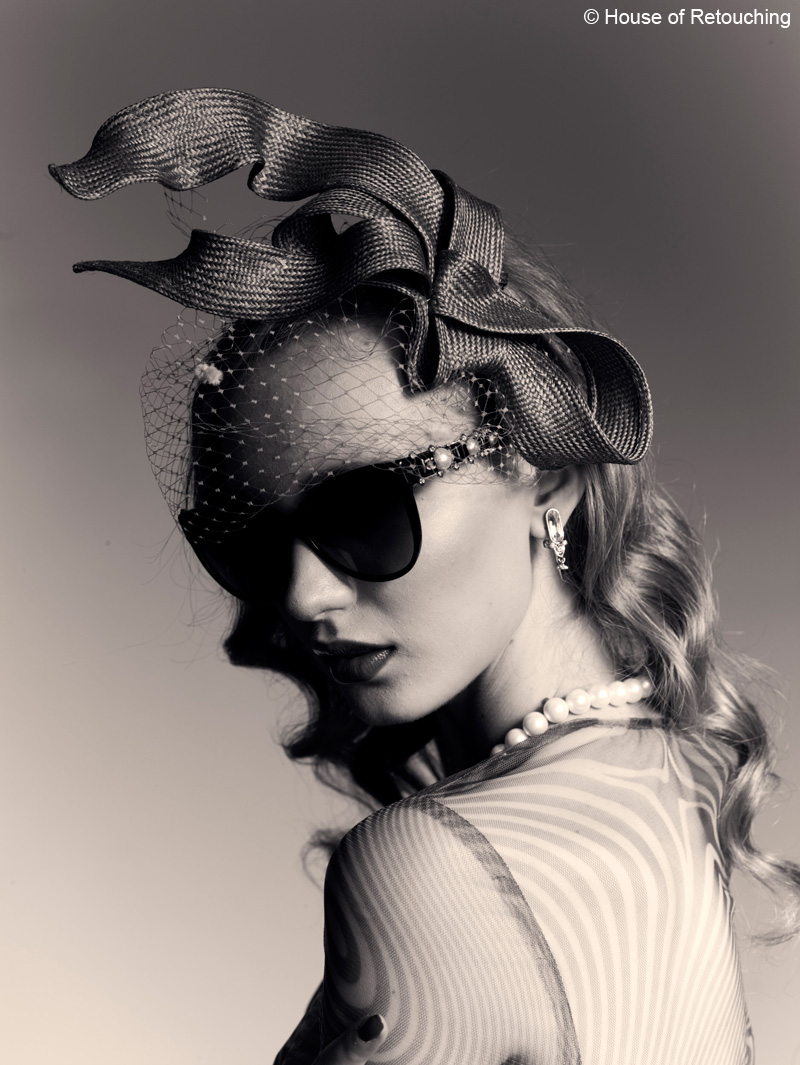
In this case the Levels are quite different as we are mainly altering the highlights to give the black and white photograph a more crispy look with more punch.
Apart from altering the black and white points in the main RGB controls we’ve also played around with the individual channels (which apart from changing contrast) gave us the ability to tone the image. This of course would not be possible if we would have had the black and white panel turned on, so we decided not to use it and only de-saturate using the standard slider.
Below you can see all other corrections used.
The possibilities of Capture One are endless when we combine the whole toolset, but limiting your options usually produces better results. As you saw we mainly used Levels for this image and yet the results are really varied.
Don’t be afraid to experiment and push your work in new directions. Make a number of Variants and experiment with different looks. Take a break, walk away from your screen for a few minutes and then pick the one that best suits your style (or delete them all and start again).
One more tip from our experience is to set colors in the morning. Later on in the day when the brain is tired we are never able to achieve the same result. We know that if you are new to Levels it might be a bit hard at the beginning, but it’s really worth it. We promise 😉
Best regards
Tomasz & Krzysztof
House of Retouching
Tomasz has a photography background, while Krzysztof comes from the advertising and computer world. Since 2006 they've been runing House of Retouching, a high end post-production studio specializing in fashion, portraiture, celebrity and commercial photography. Their portfolio includes clients like British Vogue, Vanity Fair, Warner Bros, Ogilvy & Mather, American Express and many others. They strive for a perfect yet natural look.
Thank you very much for this article. Most of the time I tend to skip Levels, or doing only an automatic Levels adjustment by pressing ‘A’ (so it does an automatic monochromatic contrast adjustment), but this looks like a whole new way to develop. Will try! 🙂
I completely agree. Levels is one of my favourite tools of C1!
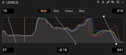
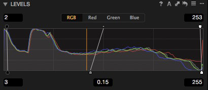
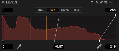
„Another standard usage is limiting the maximum RGB values.” — about this… Well, it doesn’t work as advertised, when you want to use this tool creatively for simulating extreme Push processing of underexposed film stock.
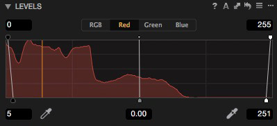
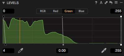
On this image: https://blog.captureone.com/wp-content/uploads/sites/2/1_levels1.jpg you show that the output RGB should be between minimum rgb(10,10,10) and maximum rgb(215,215,215), while cutting the black level at rgb(27,27,27) and white at rgb(241,241,241). Are you completely sure you don’t have values below 10 and over 215 in your output image/histogram? Attached is extreme example which shows it doesn’t work this way.
The Curve tool has the same limitation, bringing back the cut shadows.
Fortunately, we have now the Color Balance tool, where lifting Shadows really works. 🙂
I’m posting that to say, that while you show the power in the tool, talk about it’s limitations and workarounds too.
Sorry, but it’s all beyond me. Much too technical and complicated for an ordinary photographer!
“Much too technical and complicated for an ordinary photographer!”
Maybe too complicated FOR YOU – but this “ordinary photographer has no problem with the article…
Hello Marcin,
Of corse in such a short post I could not explain all the interaction between all the ways Levels can be used. As you see in my example of limiting values I only used levels in this way. Therefore it worked as I wrote.
What you are saying is also true. Once you change individual channels or start altering other point you need to alter the cutoff to compensate. Yet it is still a good way for setting the limiting point, you just need to be aware that it is not as simple as it seems.
I prefer not to use the white balance tool for black and white point adjustments as there are no numeric value indications which makes it often hard to control between many images.
Good luck with playing around with levels 🙂
Tomasz
Hi Tomasz.
Thanks for taking the time for answering me. 🙂
I have one note to your reply — „there are no numeric value indications which makes it often hard to control between many images” — that’s what I was trying to say, but about the Levels tool— you can’t trust these numeric value indicators. The clipping Output Values are not hard limits, they can’t be used as an absolute reference! It all depends on the dynamic range of the input RAW file, and clipping set in the Input Values. The Input, Output and RAW Dynamic range are tightly bound in the Levels/Curves tools.
So you can’t use these numeric values as your reference, it will bite you hard when you will process images for use in TV/Video or other broadcasting system (where luma is limited to 16…235 range (Rec. 709, “studio–swing” range)).
Let me cite PhaseOne Support, case #159712:
—–
The method by which Capture One works is by design. As Capture One is a RAW Image editing software, the method by which you would integrate the Levels tool should specifically avoid any clipping. Should you choose to clip the image data using the Levels Tool, you can do so by only editing the Output values. In this respect, Capture One and Photoshp are the same. Where Capture One and Photoshop differ is, when editing the Input Values, you are not clipping the data using the Output Value as the absolute reference. Instead you are clipping relative to the original RAW file’s 0-255 absolute values. This is again designed to retain as much information as possible in the image editing process.
—–
I hope you see where the challenge is. 🙂
PS: If you want numeric references for the Color Balance tool (not white balance, it’s other tool), you can use the Add Color Readout tool. I think it’s the only right way to check what colour range the final image will have.
The power of the Color Balance tool lies in the fact, that it’s not bound to the input data, only the output — so you can make a preset touching only the shadows/highlight luminosity sliders with the colour readout, and be 100% sure that no image using that preset will go beyond these values. That is control.
Sincerely,
Marcin
I like the most the photo without retouching because you have make disappear the red lips, and the black pearl does not mean nothing☺.
I ofthen use Levels to adjust the imagen after working with the rest of the tools.
This article makes me nostalgically remember CaptureOne 3.7 (RIP), where you could independently control the midpoint of the clip values…
Yes Branco, 3.7 was king for so many years. I loved it. We were still working on it even when C1 5 was around. So simple yet so effective!
I have to say, Capture One has come as a revaluation to me. Even files opened in Lightroom and finished in Photoshop, I have been able to push further in terms of sharpness, colour and levels. I’ve added C1 as a final step to all files, regardless of starting point.
‘Revelation.’ Autocomplete….
Levels sold Capture One to me. The auto function is brilliant and can set a beginning adjustment with no effort. Often for personal photography such as family snaps it will be the main and only tool.
I have had Photoshop since CS2 and can get similar looks , but it takes more work.
But there are also handles in color balance to adjust contrast of shadows , mid and highlights ?!